
Yolickity is a local store offering frozen yogurt, ice cream and gelato with many flavors and toppings to choose from.
The goal of this project is to enhance the Yolickity website by redesigning the entire user experience with a focus on intuitive navigation and brand identity. This redesign will allow users to easily find information, explore products, and interact with the brand regardless of device, ability, or technical skill.
Personal UX redesign project for a frozen yogurt website
Yolickity
Yolickity
Personal UX redesign project for a frozen yogurt website
Yolickity is a local store offering frozen yogurt, ice cream and gelato with many flavors and toppings to choose from.
The goal of this project is to enhance the Yolickity website by redesigning the entire user experience with a focus on intuitive navigation and brand identity. This redesign will allow users to easily find information, explore products, and interact with the brand regardless of device, ability, or technical skill.
My Role
Research
Product Design
User Experience Design
Usability Testing
Research
Product Design
User Experience Design
Usability Testing
Duration
5 Weeks
5 Weeks
Tools
Adobe Illustrator
Figma
Notability
Adobe Illustrator
Figma
Notability
My Role
Research
Product Design
User Experience Design
Usability Testing
Duration
5 Weeks
Tools
Adobe Illustrator
Figma
Notability
The Challenge
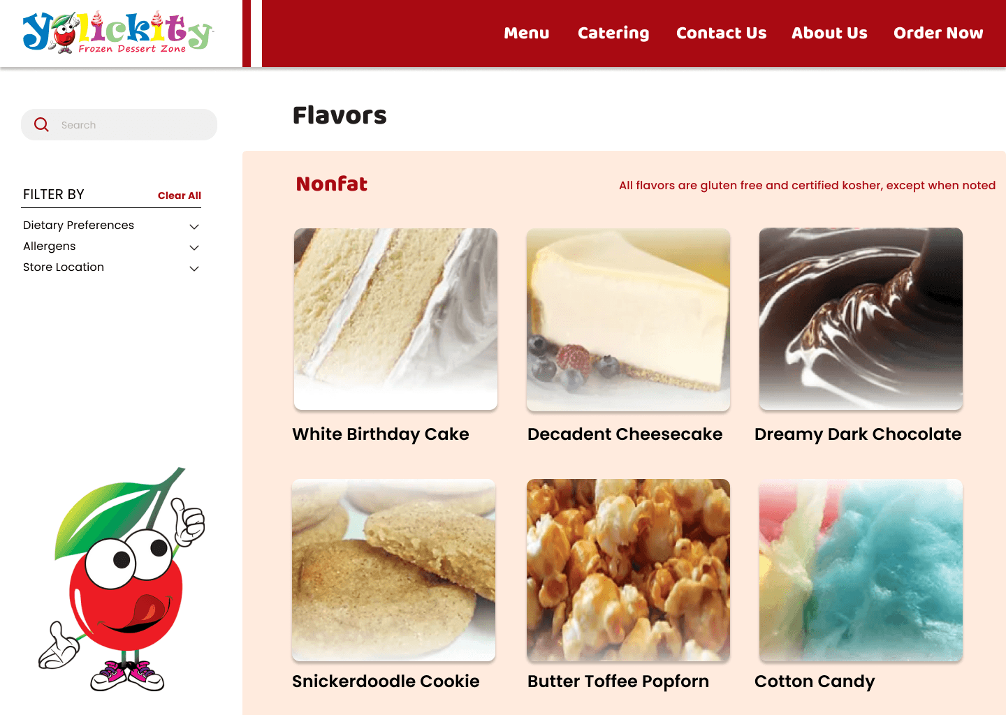
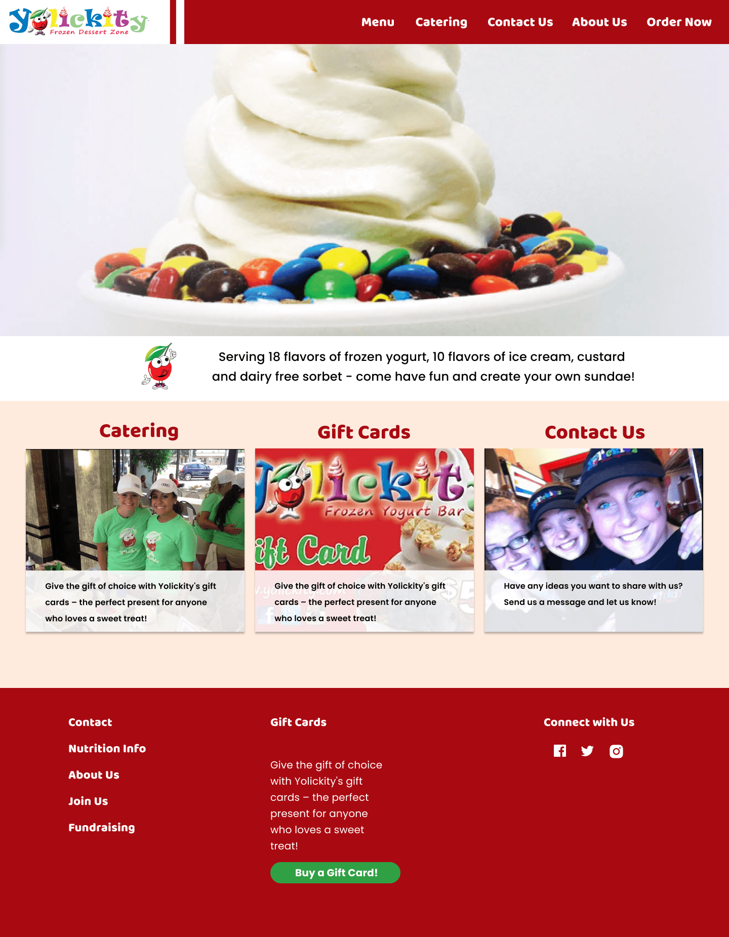
While Yolickity is a well-known local store, its website struggles to attract and retain users. The site’s overly bright colors create visual strain, while its cluttered layout and confusing navigation make it difficult for customers to find essential information. These design challenges not only hinder user experience but also discourage potential customers from being convinced to visit the store.
The Solution
To design a user-friendly and accessible website for Yolickity, ensuring seamless navigation and providing a clear, consistent pathway to the external ordering platform.
The Solution
Research
SWOT Analysis
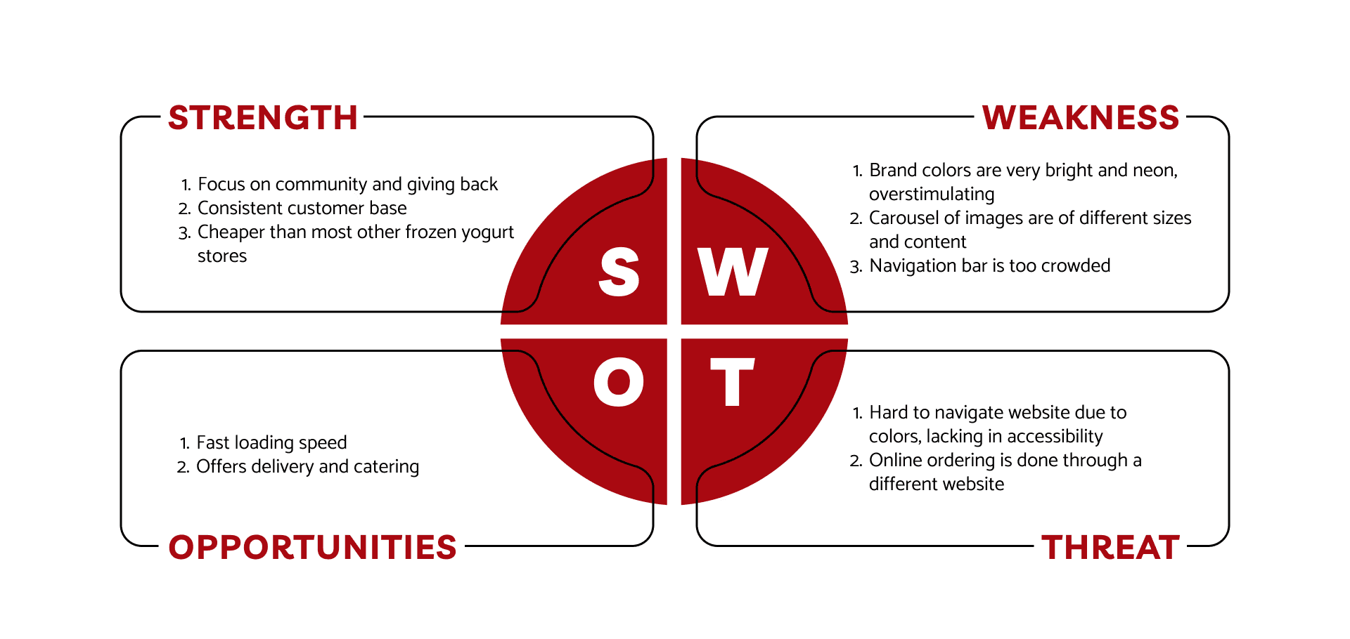
To begin, I conducted a SWOT analysis of the current website to identify its strengths, weaknesses, opportunities for improvement, and potential threats. I wanted to ensure that the redesign was grounded in a thorough understanding of the business's position, challenges and opportunities.
Define
The primary goal was to create a user-friendly website that aligns with Yolickity’s vibrant brand identity while addressing its usability issues. This included simplifying navigation, improving accessibility, and highlighting key features such as store locations and contact forms.
The current Yolickity website is very outdated and difficult to navigate. The lack of accessibility standards throughout the website tends to lose the company more new customers than they are gaining.
Scope
With a five-week timeline, I defined a focused scope to ensure the redesign was both achievable and effective. Lacking direct input from the owners, I assumed their primary goal was to attract more customers while maintaining Yolickity’s brand identity. To address this, I retained the core content of each page while focusing on improving navigation and usability.
The primary goal was to create a user-friendly website that aligns with Yolickity’s vibrant brand identity while addressing its usability issues. This included simplifying navigation, improving accessibility, and highlighting key features such as store locations and contact forms.
The current Yolickity website is very outdated and difficult to navigate. The lack of accessibility standards throughout the website tends to lose the company more new customers than they are gaining.
Define
With a five-week timeline, I defined a focused scope to ensure the redesign was both achievable and effective. Lacking direct input from the owners, I assumed their primary goal was to attract more customers while maintaining Yolickity’s brand identity. To address this, I retained the core content of each page while focusing on improving navigation and usability.
Scope
To begin, I conducted a SWOT analysis of the current website to identify its strengths, weaknesses, opportunities for improvement, and potential threats. I wanted to ensure that the redesign was grounded in a thorough understanding of the business's position, challenges and opportunities.
Research
SWOT Analysis
User Interviews
I conducted interviews with both new and returning customers of Yolickity to gather feedback on the website’s usability. New customers were asked to assess how easily they could find key information, while returning customers provided insights on navigation and features. This feedback helped identify areas for improvement, such as content organization and accessibility, to better meet the needs of all users.
Favorites
Highlight opportunities to order online and cater
Opening the website was very off throwing, to new and returning customers
Navigation bar is too crowded
Online ordering page is redundant
Drawbacks
Favorites
Highlight opportunities to order online and cater
Opening the website was very off throwing, to new and returning customers
Navigation bar is too crowded
Online ordering page is redundant
Drawbacks
User Testing
Given that the primary focus of this project was improving navigation, I conducted a card sorting exercise with five users to understand their preferences for organizing content. This user-centered method helped identify how they naturally grouped information, allowing me to design a more intuitive information architecture and streamline the website’s navigation structure.
I started sketching out some wireframes on my iPad. With these simple wireframes, I conducted A/B testing with users to test potential layouts
Design
Initial Wireframes
Create
As I wanted to try and keep the original Yolickity logo and mascot, I created the color palette off existing colors and complementing from the mascot.


Design
Initial Wireframes
I started sketching out some wireframes on my iPad. With these simple wireframes, I conducted A/B testing with users to test potential layouts.
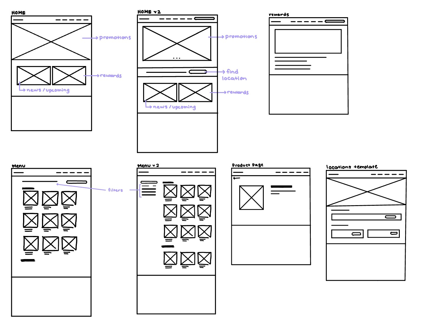

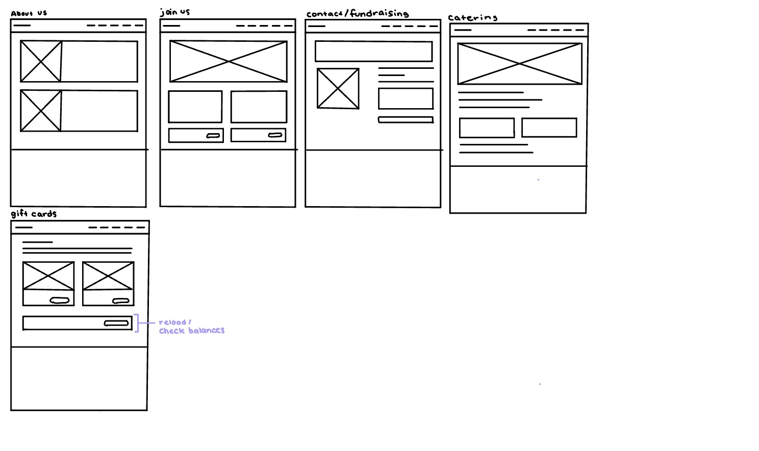

These were the final wireframes I used as a foundation for the designs I created.
These were the final wireframes I used as a foundation for the designs I created.
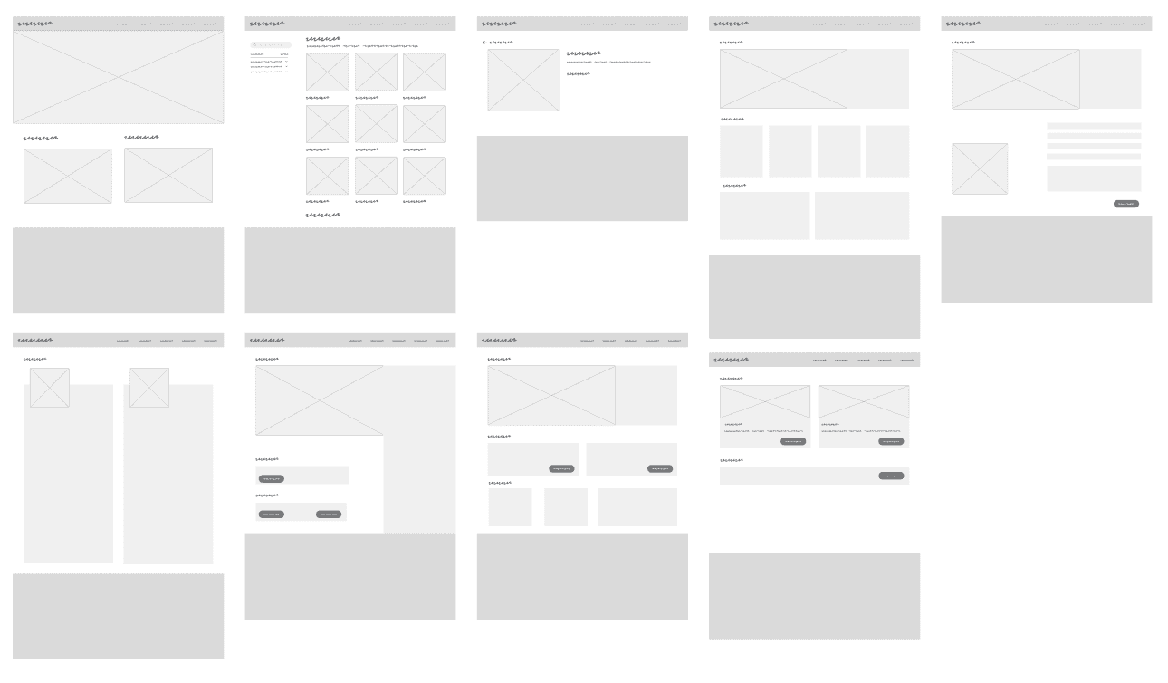

Final Designs
As I wanted to try and keep the original Yolickity logo and mascot, I created the color palette off existing colors and complementing from the mascot.
Create

Final Design


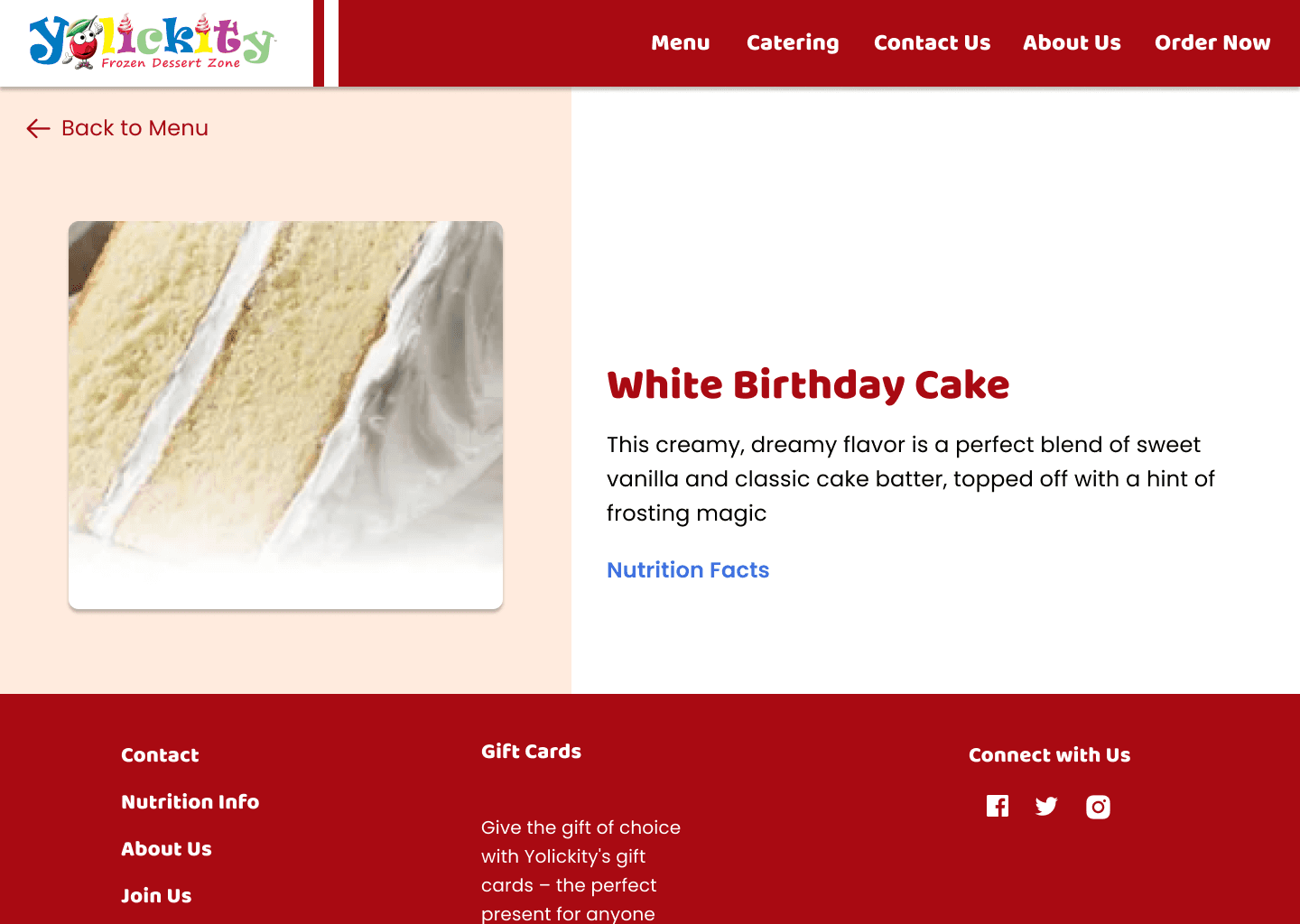

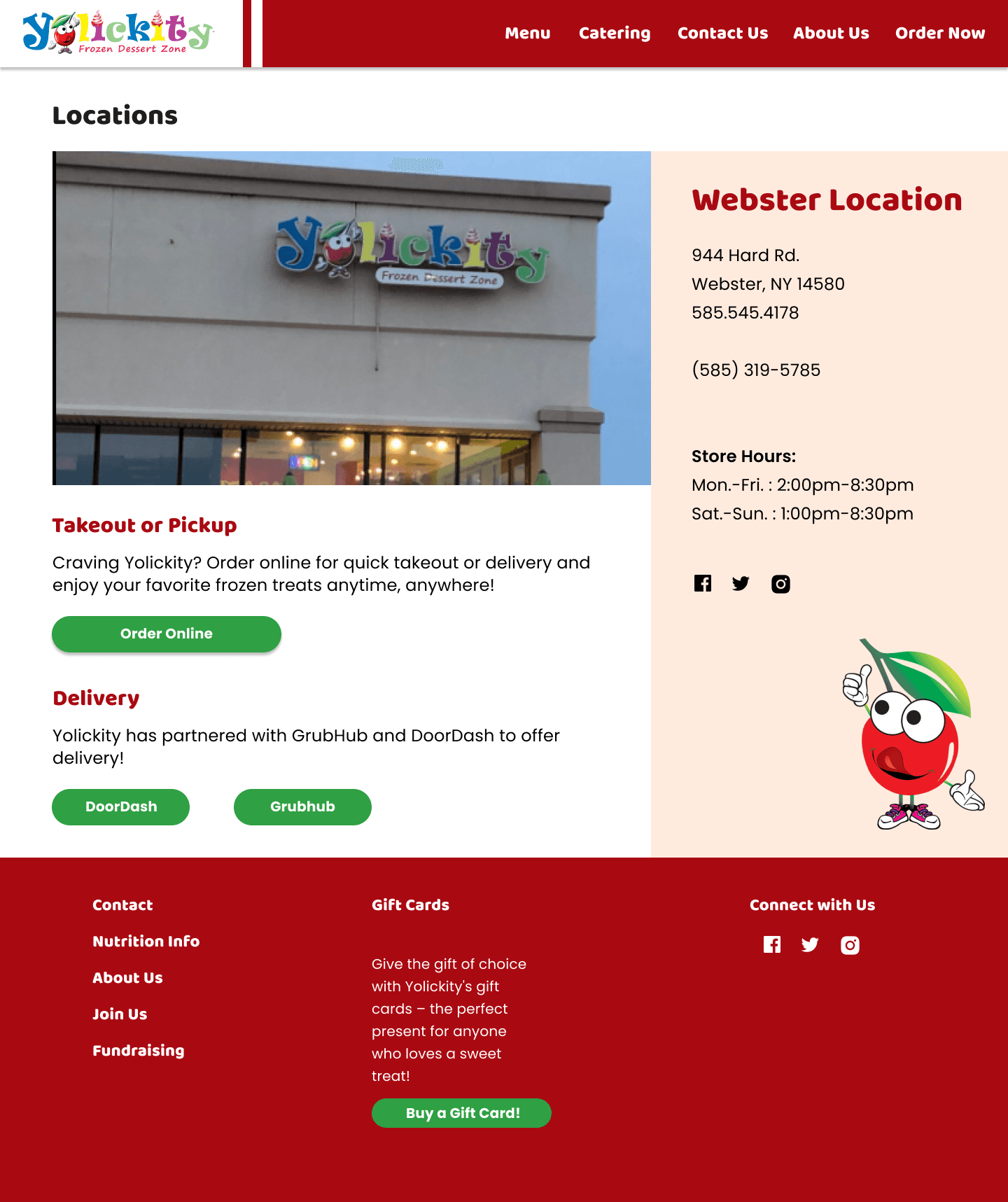

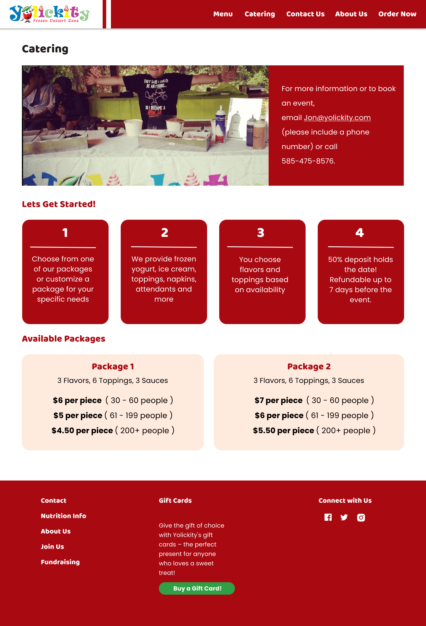

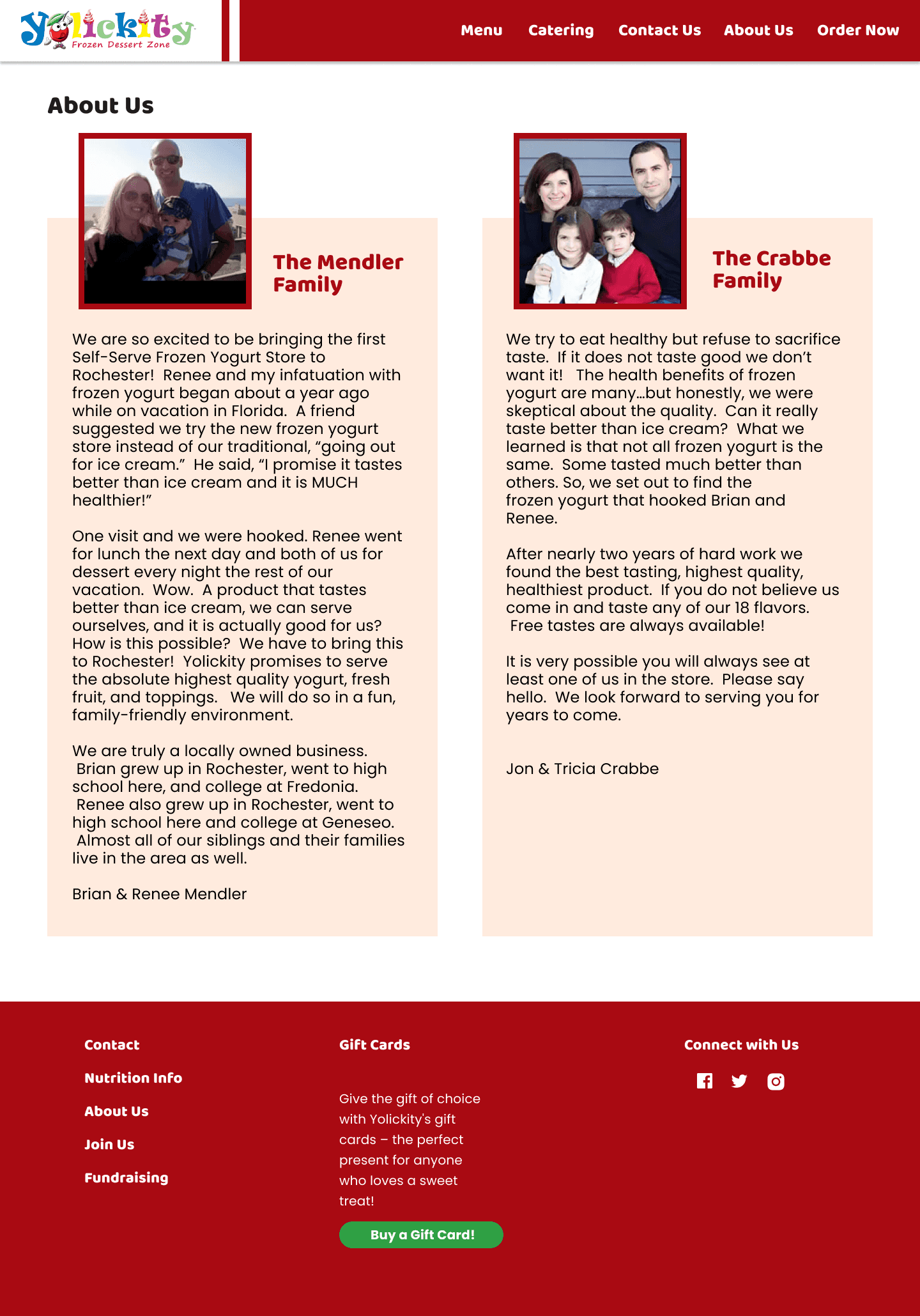

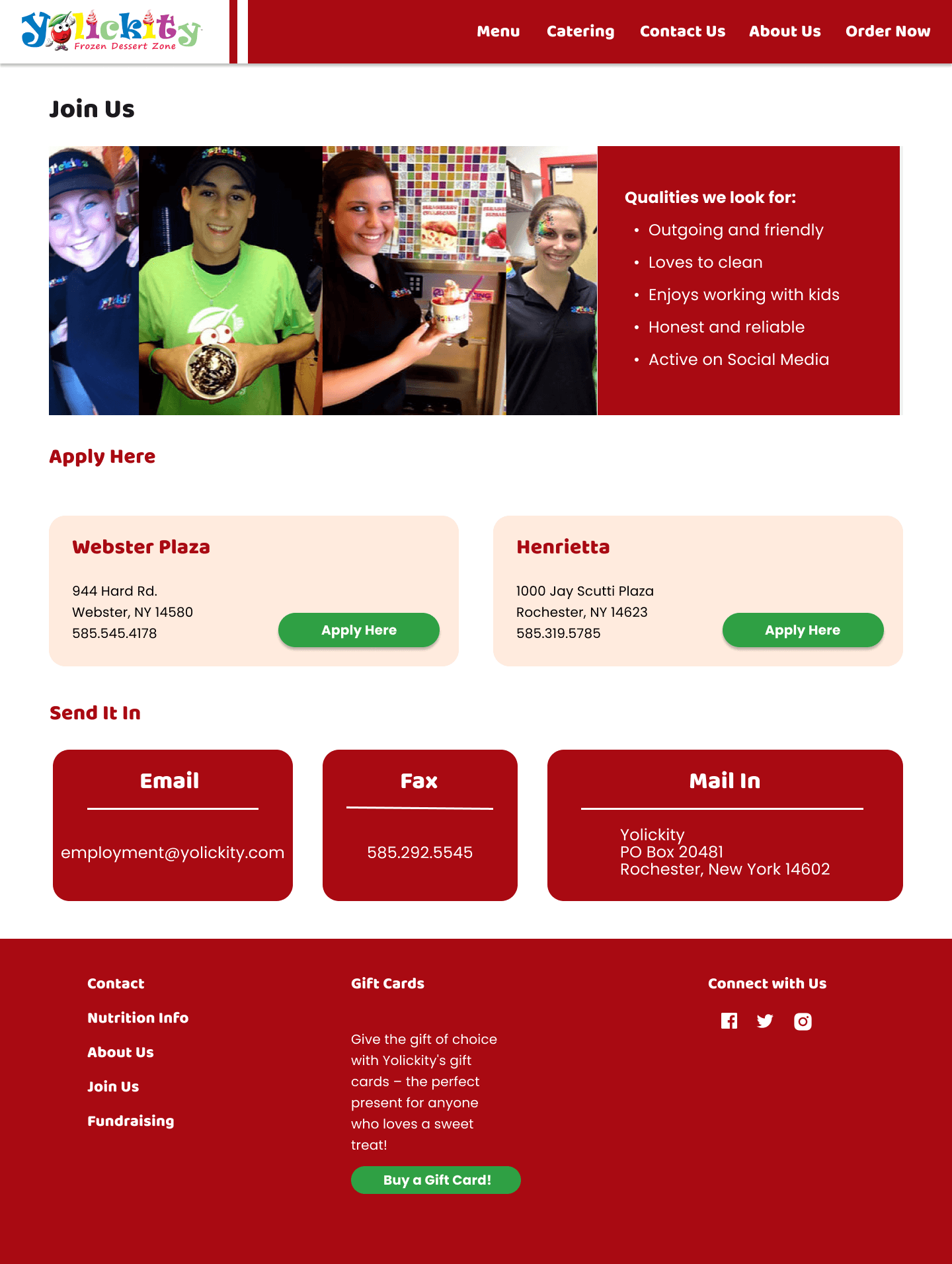

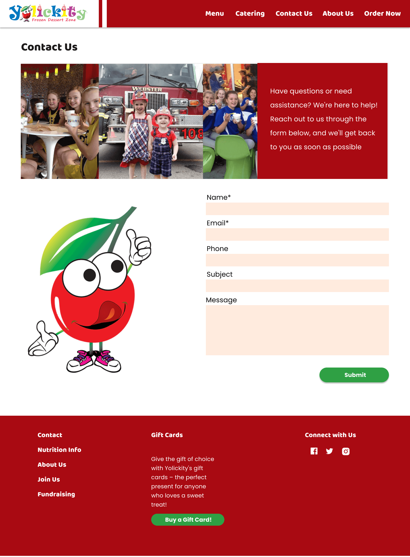

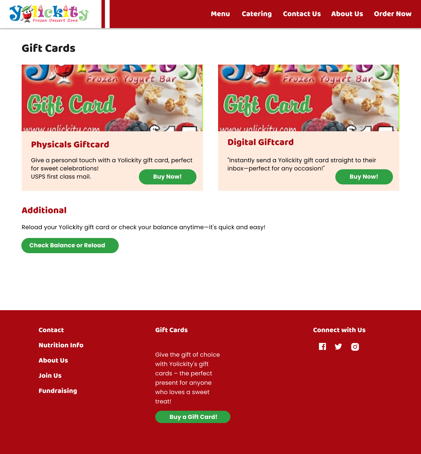


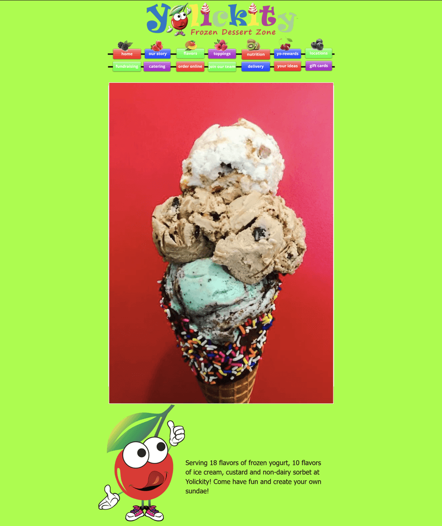


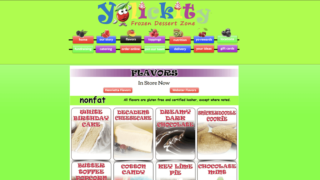


A comparison of before and after page designs.
Comparison


Reflections
I learned from my previous two projects that having one more step of wireframes between sketch and final was really helpful so I implemented that into this project's process and it really did help streamline some of the process.
Given the scope of this project and the restrictions I had, I believe I did improve upon the navigation and accessibility issues presented in the original Yolickity website. However, I know I lost some of the fun and charm in my current redesign. As my next steps, I would conduct further user testing and keep the new navigation system while trying to add a little more character to each page.
Hi!
Thank you for making this far! If you want to learn more about me, please feel free to reach out!
Please check out my Resume as well!
Hi!
Thank you for making this far! If you want to learn more about me, please feel free to reach out!
Please check out my Resume as well!
Hi!
Thank you for making this far! If you want to learn more about me, please feel free to reach out!
Please check out my Resume as well!