Redefining Brand Identity.
Redefining Brand Identity.
During my internship at Sandbox Union, the company underwent a significant rebranding initiative that included a creating logos for services offered. Tasked with this responsibility, I focused on creating modern, impactful identities that resonate with our target audiences.
To align with the CEO's vision, I developed multiple sketches and variations, meticulously attending to every detail to ensure the final logos effectively represented our brand values and strengthened our market presence. Afterwards, I created the company’s first brand book to help keep future designs consistent.
Initial Sketches
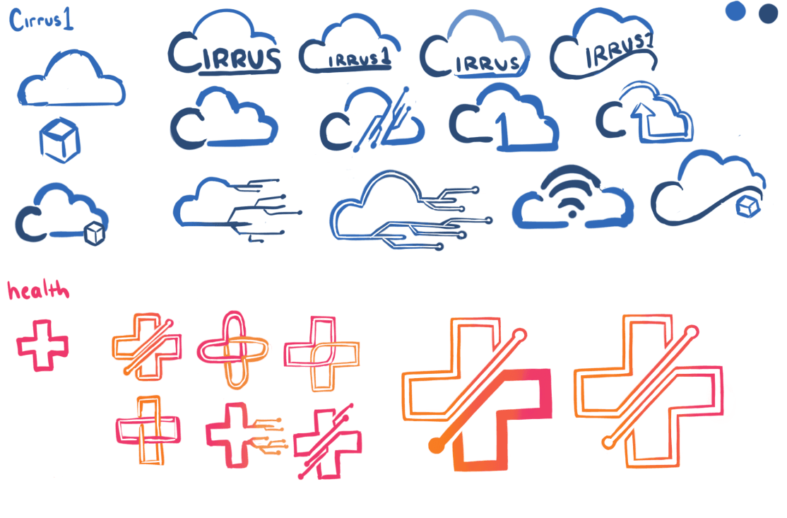
Armed only with the names of our services, Cirrus1 and SBU Health, I began sketching a variety of design concepts. As the company's design direction shifted towards minimalism while maintaining recognizability, I concentrated on the silhouettes of the icons. My goal was to ensure that each design remained easily relatable to both the service offered and its name.

Refinement
Following a meeting with the CEO, we selected the designs that resonated most with her vision. For Cirrus1, I handed off the third design in the second row to a fellow designer while concentrating on refining the SBU Health logo.
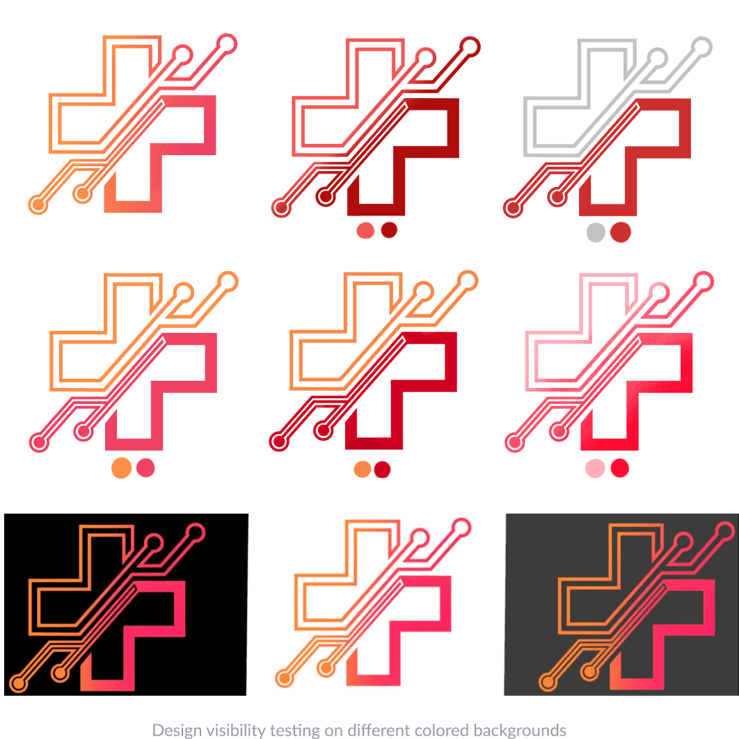
During our discussion, the CEO expressed interest in exploring more intricate designs for the SBU Health logo, which I presented alongside various color variations. However, concerned about the logo's visibility and clarity in smaller formats, I suggested reverting to a solid block design at the bottom, a change she agreed with.

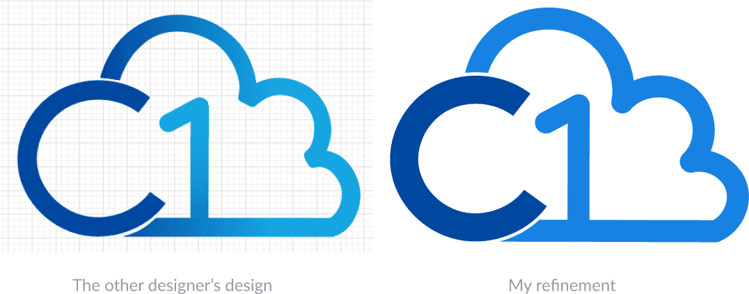
During our next meeting, the designer I collaborated with presented the design on the left for Cirrus1. After discussing it further, I took the opportunity to refine the design by increasing the stroke on the 'C' to enhance its distinction.
Additionally, I rounded the corners of the cloud to create a contrast with the sharp edges of the 'C,' adding visual interest and cohesion to the overall logo.

Initial Sketches
Armed only with the names of our services, Cirrus1 and SBU Health, I began sketching a variety of design concepts. As the company's design direction shifted towards minimalism while maintaining recognizability, I concentrated on the silhouettes of the icons. My goal was to ensure that each design remained easily relatable to both the service offered and its name.

Refinement
Following a meeting with the CEO, we selected the designs that resonated most with her vision. For Cirrus1, I handed off the third design in the second row to a fellow designer while concentrating on refining the SBU Health logo.
During our discussion, the CEO expressed interest in exploring more intricate designs for the SBU Health logo, which I presented alongside various color variations. However, concerned about the logo's visibility and clarity in smaller formats, I suggested reverting to a solid block design at the bottom, a change she agreed with.


During our next meeting, the designer I collaborated with presented the design on the left for Cirrus1. After discussing it further, I took the opportunity to refine the design by increasing the stroke on the 'C' to enhance its distinction.
Additionally, I rounded the corners of the cloud to create a contrast with the sharp edges of the 'C,' adding visual interest and cohesion to the overall logo.


Initial Sketches
Armed only with the names of our services, Cirrus1 and SBU Health, I began sketching a variety of design concepts. As the company's design direction shifted towards minimalism while maintaining recognizability, I concentrated on the silhouettes of the icons. My goal was to ensure that each design remained easily relatable to both the service offered and its name.


Refinement
Following a meeting with the CEO, we selected the designs that resonated most with her vision. For Cirrus1, I handed off the third design in the second row to a fellow designer while concentrating on refining the SBU Health logo.
During our discussion, the CEO expressed interest in exploring more intricate designs for the SBU Health logo, which I presented alongside various color variations. However, concerned about the logo's visibility and clarity in smaller formats, I suggested reverting to a solid block design at the bottom, a change she agreed with.

During our next meeting, the designer I collaborated with presented the design on the left for Cirrus1. After discussing it further, I took the opportunity to refine the design by increasing the stroke on the 'C' to enhance its distinction.
Additionally, I rounded the corners of the cloud to create a contrast with the sharp edges of the 'C,' adding visual interest and cohesion to the overall logo.

Final Logo Designs

Brand Book
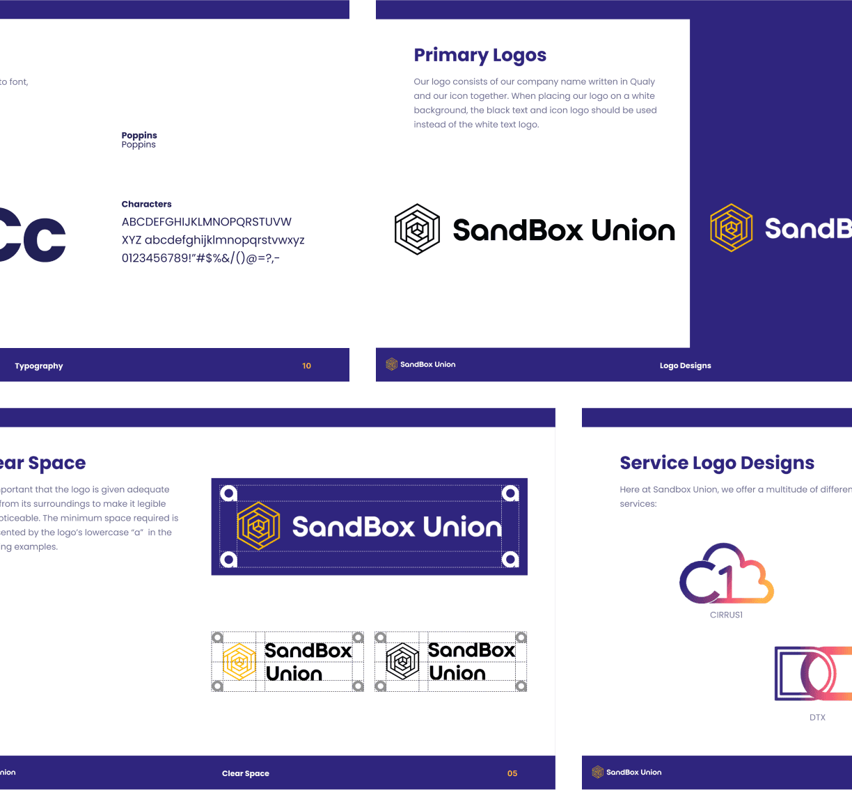
To fully finish this project, I worked on and created the company’s first brand book, some pages of which you can see below.
Brand Book
To fully finish this project, I worked on and created the company’s first brand book, some pages of which you can see below.
Final Logo Designs




Hi!
Thank you for making this far! If you want to learn more about me, please feel free to reach out!
Please check out my Resume as well!
Hi!
Thank you for making this far! If you want to learn more about me, please feel free to reach out!
Please check out my Resume as well!
Hi!
Thank you for making this far! If you want to learn more about me, please feel free to reach out!
Please check out my Resume as well!
Hi!
Thank you for making this far! If you want to learn more about me, please feel free to reach out!
Please check out my Resume as well!
Hi!
Thank you for making this far! If you want to learn more about me, please feel free to reach out!
Please check out my Resume as well!