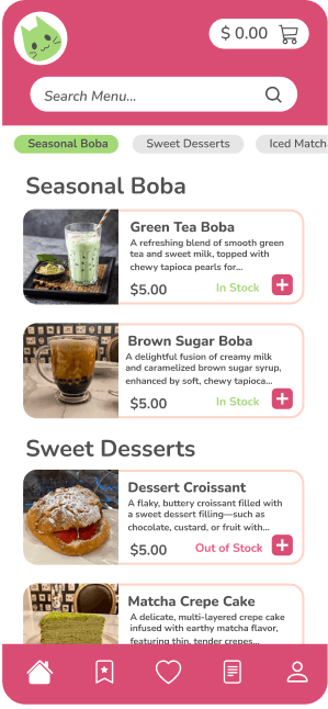

BobaCat is a mobile app concept for a local boba shop, aimed at improving the customer experience by streamlining the ordering process.
This project was designed as a personal initiative to explore mobile app development, focusing on creating an intuitive and accessible app that reflects the cozy atmosphere of a single boba store. The design process covered everything from user research and wireframing to the creation of high-fidelity prototypes.
Personal object for a bubble tea mobile app
BobaCat
BobaCat
Personal project for a bubble tea mobile app
BobaCat is a mobile app concept for a local boba shop, aimed at improving the customer experience by streamlining the ordering process.
This project was designed as a personal initiative to explore mobile app development, focusing on creating an intuitive and accessible app that reflects the cozy atmosphere of a single boba store. The design process covered everything from user research and wireframing to the creation of high-fidelity prototypes.
My Role
Research
Product Design
User Experience Design
Usability Testing
Duration
5 Weeks
Tools
Adobe Illustrator
Figma
Lucid Chart
My Role ( Team of 2 )
Research
Product Design
User Experience Design
Usability Testing
Duration
5 Weeks
Tools
Adobe Illustrator
Figma
Lucid Cart
The Challenge
As a recently acquired acquisition, Gideon Legal designs were sorely outdated.
The form builder interface was complex and cluttered, leading to confusion and difficulty in navigation for users. The core issue was the need for a new and improved interface that offered an intuitive and engaging experience while simplifying the user journey.
The Solution
I developed an innovative mobile app for a local boba shop to meet the growing demand for convenient online ordering while enhancing user engagement.
By conducting comprehensive user interviews and market analysis, I identified key customer needs and preferences, translating them into a efficient product with essential features. My approach prioritized defining core functionalities and shaping the app's strategic direction to encourage customers to embrace mobile ordering.
The Challenge
Many customers would prefer the convenience of ordering online, but currently, the boba shop lacks a dedicated mobile app for this service. My primary challenge was to design a seamless and engaging online ordering experience that meets customer needs and encourages adoption.
Additionally, the shop struggles with effectively communicating its menu offerings and promotions, leading to missed opportunities for customer engagement and loyalty.
How can I design a mobile app for a local bubble tea shop that provides customers with a convenient online ordering option while effectively communicating menu offerings and promotions?
How can I design a mobile app for a local bubble tea shop that provides customers with a convenient online ordering option while effectively communicating menu offerings and promotions?
The Solution
I developed an innovative mobile app for a local boba shop to meet the growing demand for convenient online ordering while enhancing user engagement.
By conducting comprehensive user interviews and market analysis, I identified key customer needs and preferences, translating them into a efficient product with essential features. My approach prioritized defining core functionalities and shaping the app's strategic direction to encourage customers to embrace mobile ordering.
Research
User Interviews
The goal of the user research was to understand the pain points and preferences of customers when using a mobile app to order food.
I conducted user interviews with a mix of frequent and occasional customers to gather insights into their preferences and the features they value most in a food ordering app along with pain points:
+ Inventory Visibility
+ Customization Options
+ Favorites and Reordering
+ Order Ahead
Market Analysis
I wanted to explore how similar businesses were using mobile apps to meet customer demands.
By analyzing competitors and industry leaders, I aimed to identify successful strategies for streamlining the ordering process, enhancing user experience, and fostering brand loyalty. This research helped me understand which features were most effective in driving customer satisfaction and repeat usage, along with what flaws to avoid.
The goal of the user research was to understand the pain points and preferences of customers when using a mobile app to order food.
I conducted user interviews with a mix of frequent and occasional customers to gather insights into their preferences and the features they value most in a food ordering app along with pain points:
+ Inventory Visibility
+ Customization Options
+ Favorites and Reordering
+ Order Ahead
Research
User Interviews
"I've experienced ordering items online, only to arrive for pickup and find out the item was out of stock.”
“It's more difficult to customize an order online compared to in person as many drinks come with fixed options that can't be easily adjusted.”
“I really wish there was an option to quickly reorder my past orders or save my favorite drinks. It would make the whole ordering process so much more easier.”
Design
User Task Flow
Keeping the research in mind, I started by creating some user flows to map out the steps a user would take for each key action.
Market Analysis
I wanted to explore how similar businesses were using mobile apps to meet customer demands.
By analyzing competitors and industry leaders, I aimed to identify successful strategies for streamlining the ordering process, enhancing user experience, and fostering brand loyalty. This research helped me understand which features were most effective in driving customer satisfaction and repeat usage, along with what flaws to avoid.
Favorites
Reward System to keep customers coming back
Simple payment system to prevent frustration
Grouping content for ease of navigation
Lack of customization options
Missing option to view order history
Easy to place orders without price confirmation
Drawbacks
Favorites
Reward System to keep customers coming back
Simple payment system to prevent frustration
Grouping content for ease of navigation
Lack of customization options
Missing option to view order history
Easy to place orders without price confirmation
Drawbacks
User Testing
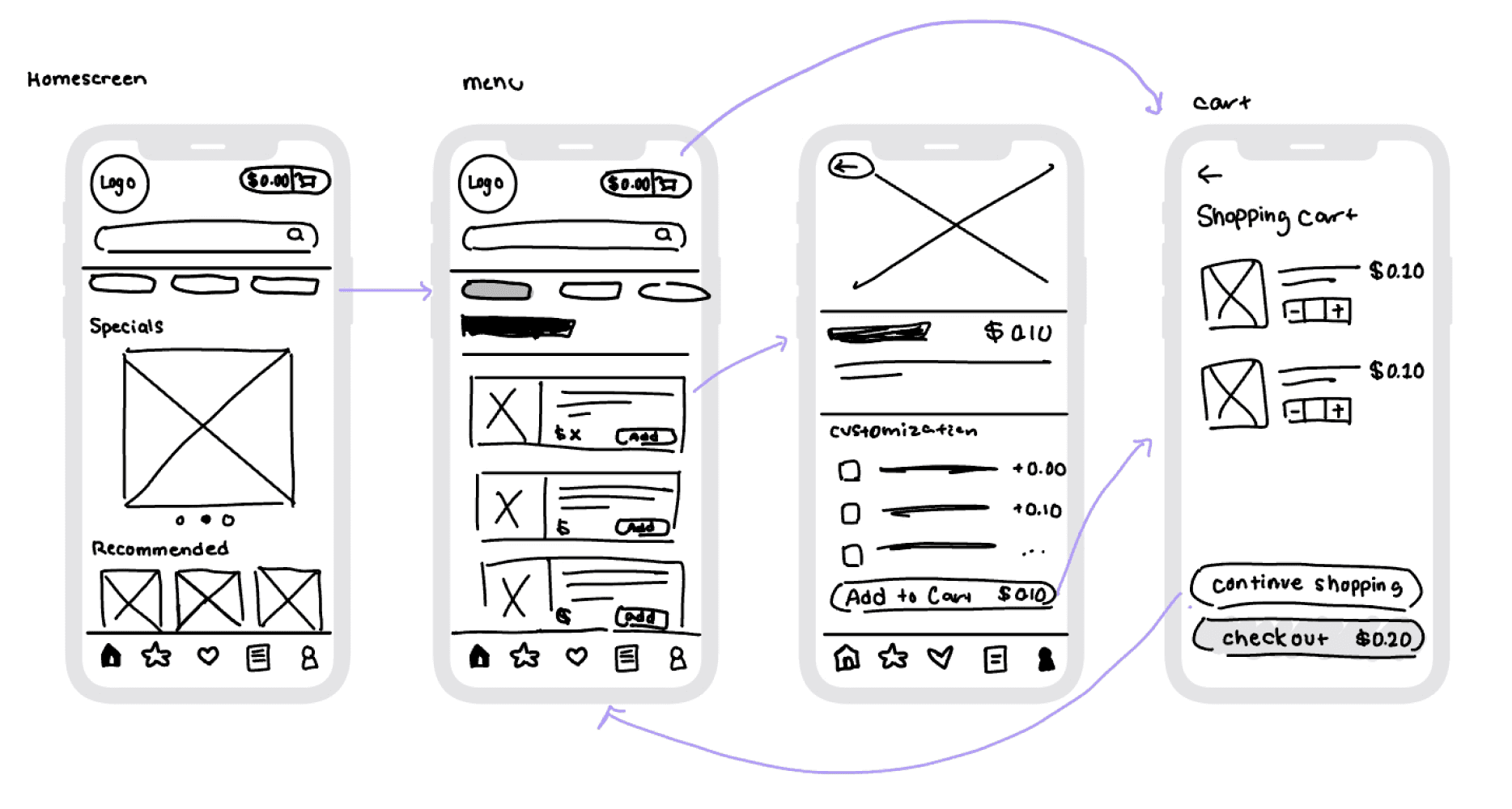
Afterwards, I started working on lo-fidelity wireframes to properly sketch out my ideas. Using the sketched out wireframes, I asked different users to test out the app. By reading and watching the users progress through the app, I was able to identify a few issues to be addressed.
Keeping the research in mind, I started by creating some user flows to map out the steps a user would take for each key action.
Design
User Task Flow
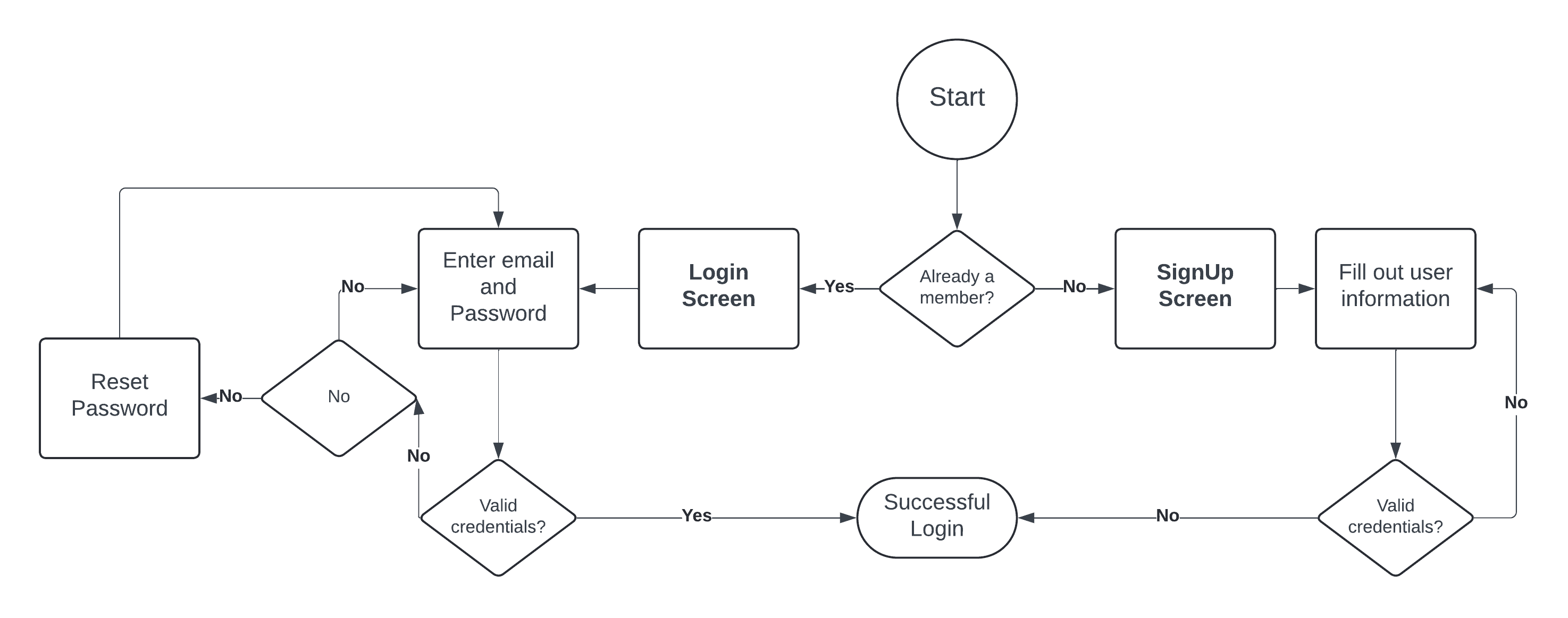
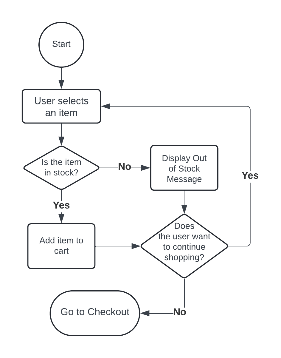
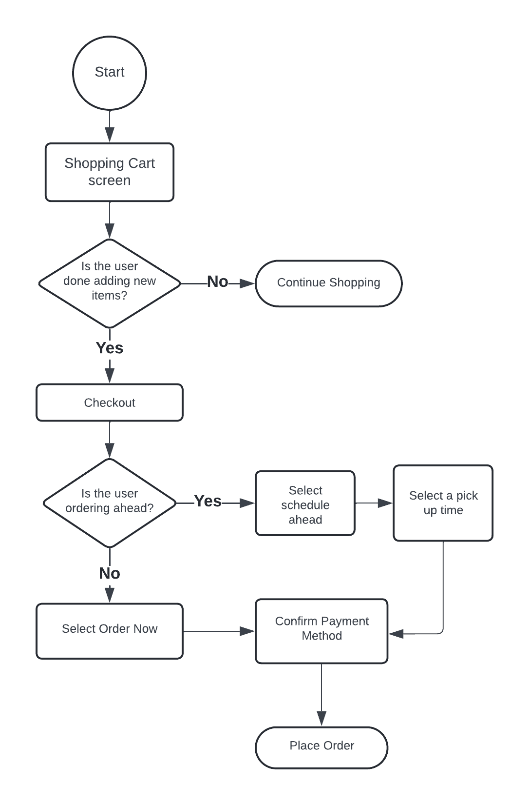
User Registration / Login
Place Order
Add to Cart


User Registration / Login
Place Order
Add to Cart
User Testing
Afterwards, I started working on lo-fidelity wireframes to properly sketch out my ideas. Using the sketched out wireframes, I asked different users to test out the app. By reading and watching the users progress through the app, I was able to identify a few issues to be addressed.
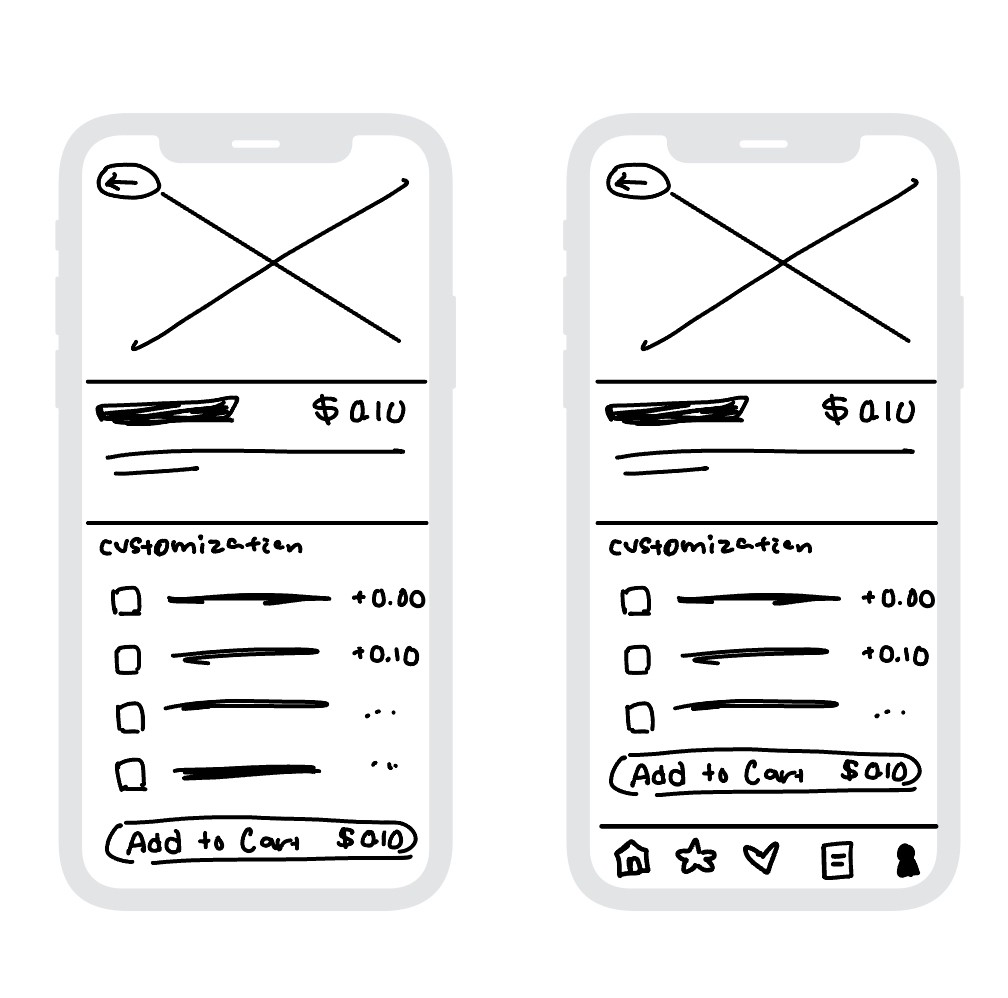
Users wanted consistency in having the bottom navigation bar when viewing product details.
After
Before
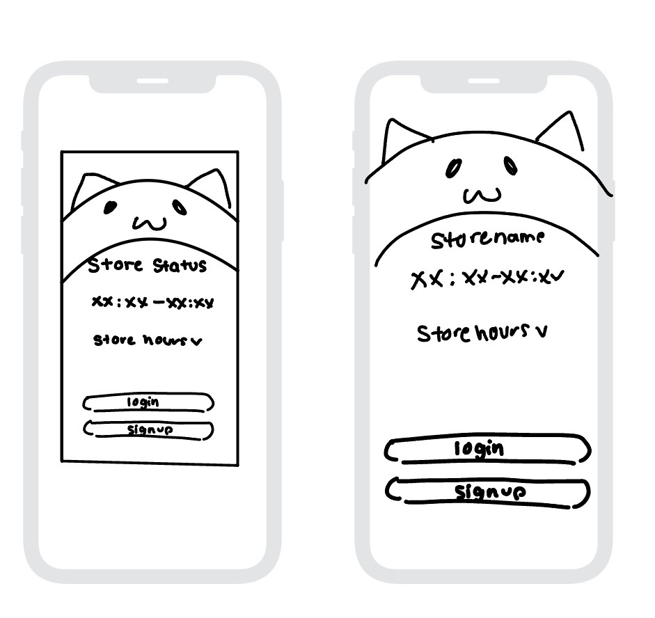
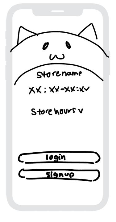
Users responded positively to displaying store hours at startup, but concerns about readability arose. To address this, the design was changed to a splash screen format.
Before
After
Before
After
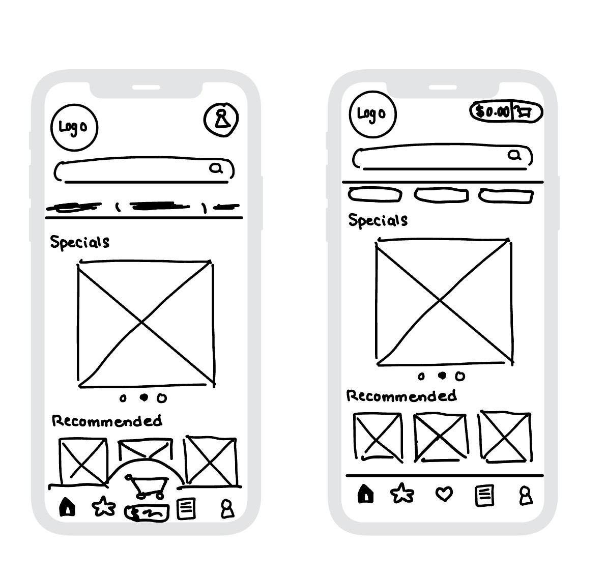
Users noted they relied on the bottom bar for navigation, and the price was uncomfortably close to the screen's bottom. Another user disliked the excess white space from combining menu categories in the top bar. To adjust, cart details were moved to the top right and menu categories were separated from the top navigation.
Users wanted consistency in having the bottom navigation bar when viewing product details.

After
Before
Users responded positively to displaying store hours at startup, but concerns about readability arose. To address this, the design was changed to a splash screen format.

Before
After

Before
After
Users noted they relied on the bottom bar for navigation, and the price was uncomfortably close to the screen's bottom. Another user disliked the excess white space from combining menu categories in the top bar. To adjust, cart details were moved to the top right and menu categories were separated from the top navigation.
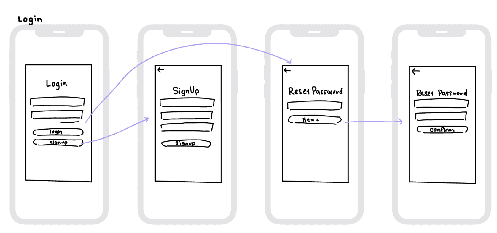
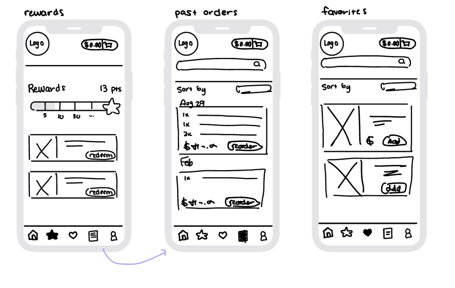
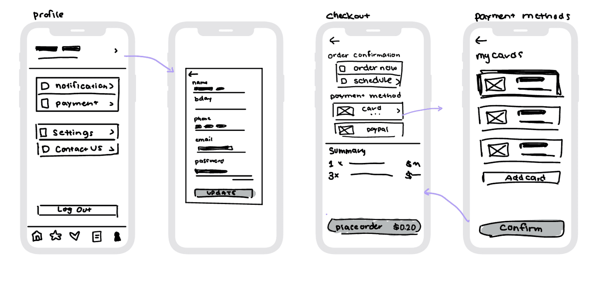
Final Lo-fi Wireframes
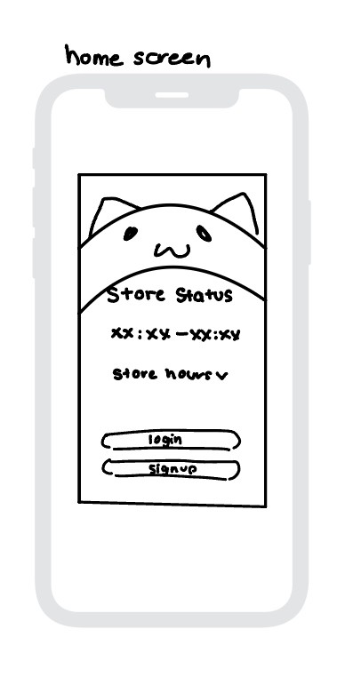
These are the final wireframes after several rounds of user testing and feedback.
Create
Bobacat’s style guide is designed around keeping the cafe’s comforting aesthetic.
The warm color palette complements the brand's vibe and was selected with accessibility in mind, ensuring contrast ratios support readability and an inclusive user experience.
Final Lo-fi Wireframes
These are the final wireframes after several rounds of user testing and feedback.


Final Designs
Bobacat’s style guide is designed around keeping the cafe’s comforting aesthetic.
The warm color palette complements the brand's vibe and was selected with accessibility in mind, ensuring contrast ratios support readability and an inclusive user experience.
Create
The font Nunito was selected for its soft, rounded design, striking a balance between comfort and professionalism. Its modern aesthetic and easy-to-read form make it an ideal choice for creating a welcoming and user-friendly experience.
Nunito Light
The font Nunito was selected for its soft, rounded design, striking a balance between comfort and professionalism. Its modern aesthetic and easy-to-read form make it an ideal choice for creating a welcoming and user-friendly experience.
Nunito Bold
CTA 2
CTA 1
The font Nunito was selected for its soft, rounded design, striking a balance between comfort and professionalism. Its modern aesthetic and easy-to-read form make it an ideal choice for creating a welcoming and user-friendly experience.
Nunito Light
The font Nunito was selected for its soft, rounded design, striking a balance between comfort and professionalism. Its modern aesthetic and easy-to-read form make it an ideal choice for creating a welcoming and user-friendly experience.
Nunito Bold
CTA 2
CTA 1

Final Designs

Final Designs

Final Designs
Reflections
This was the first full project I took on and I definitely learned a lot from this experience. When first starting out, I often focused on UI over UX. I learned how important user task flows can be as looking at them would help me focus more on prioritizing the user experience and not forget any important screens.
It also taught me a lot about timeframes for projects as there were times I definitely felt rushed about certain parts in the process. I now know how to delegate my time better and what to expect. I think making some digital lo-fi wireframes would have helped after the wireframe sketches as even though I was basing my final screens off the wireframes, there were still some designs I was uncertain about.
I learned a lot from doing the user testing and going forward, my next step would be to proceed with more testing to help keep refining my product.
Hi!
Thank you for making this far! If you want to learn more about me, please feel free to reach out!
Please check out my Resume as well!
Hi!
Thank you for making this far! If you want to learn more about me, please feel free to reach out!
Please check out my Resume as well!
Hi!
Thank you for making this far! If you want to learn more about me, please feel free to reach out!
Please check out my Resume as well!