

Case Compass
Redesign
Redesigning outdated designs with a focus on efficiency and accessibility
Case Compass is a web-based platform designed for managing complex landlord and tenant law cases for law firms.
Following its recent acquisition of Gideon Legal, Case Compass required updates to accommodate all types of practice, including a complete redesign of existing Gideon pages.
My Role ( Team of 2 )
Research
Product Design
User Experience Design
Usability Testing
Duration
2 Months
Tools
Slack
Figma
Notion
Jira
The Challenge
As a recently acquired acquisition, Gideon Legal designs were sorely outdated.
The form builder interface was complex and cluttered, leading to confusion and difficulty in navigation for users. The core issue was the need for a new and improved interface that offered an intuitive and engaging experience while simplifying the user journey.
My Role ( Team of 2 )
Research
Product Design
User Experience Design
Usability Testing
Duration
2 Months
Tools
Slack
Figma
Notion
Jira
Gideon Legal’s outdated, complex form builder frustrates users and hinders navigation, highlighting the need for a streamlined, user-friendly redesign to boost engagement and efficiency
The Solution
To better understand the challenges faced by our users, I applied empathetic design thinking methodologies.
This approach helped me understand the key issues our users were facing while finding new ways the interface could be improved. I was able to identify key user and market aspects, and translated them into a new and improved form interface.
EMPATHIZE
IDEATION
DESIGN
REFLECT
The Challenge
As a recently acquired acquisition, Gideon Legal designs were sorely outdated.
The form builder interface was complex and cluttered, leading to confusion and difficulty in navigation for users. The core issue was the need for a new and improved interface that offered an intuitive and engaging experience while simplifying the user journey.
Case Compass is a web-based platform designed for managing complex landlord and tenant law cases for law firms.
Following its recent acquisition of Gideon Legal, Case Compass required updates to accommodate all types of practice, including a complete redesign of existing Gideon pages.
Redesigning outdated designs with a focus on efficiency and accessibility
Case Compass
Redesign
TARGET AUDIENCE
KEY USER PAIN POINTS
Lawyers and Attorneys with a modest level of tech proficiency
Complex branching system
Difficulty reordering questions
As a recently acquired acquisition, Gideon Legal designs were sorely outdated.
The form builder interface was complex and cluttered, leading to confusion and difficulty in navigation for users. The core issue was the need for a new and improved interface that offered an intuitive and engaging experience while simplifying the user journey.
Empathize
As a former developer on Gideon Legal, I was already aware of several challenges users faced when creating forms. To gain deeper insights, we conducted interviews with the previous CEO, current users, and reviewed key client needs.
Recognizing that our primary users were older lawyers and attorneys, I understood the importance of simplifying the interface while maintaining efficiency and accessibility.
TARGET AUDIENCE
KEY USER PAIN POINTS
Lawyers and Attorneys with a modest level of tech proficiency
Complex branching system
Difficulty reordering questions
Empathize
Refinement
The initial design featured a drop-down menu for changing question types, but after a follow-up meeting with the clients, a shift to a box-view design was suggested, as reflected in the low-fidelity wireframes.
The approach was quickly adapted to optimize the display of question types in this new format. Additionally, the progress tracker was modified to enhance accessibility, demonstrating flexibility in pivoting and improving designs based on evolving client needs and feedback
Reflections
Working on this project as a UX Engineer after starting as a Developer was an exciting and eye-opening experience. It deepened my understanding of the critical need for effective communication between teams, particularly between design and development, to ensure a cohesive and user-centered product.
I faced challenges diving into UX with no prior experience, but by staying adaptable, asking the right questions, and continuously learning, I found UX Engineering to be both enjoyable and rewarding.
Reflecting on the project, I see areas for improvement, especially in navigation, branching dialogue, and additional features that remain unexplored. As the project evolves within the company, I’m eager to continue refining it. Overall, this experience was a pivotal starting point in my journey as a UX Engineer, reinforcing the value of clear communication, adaptability, and open-mindedness in creating effective user-focused solutions.
Design
Wireframes
Blue star indicates the initial design settled on by the stockholders
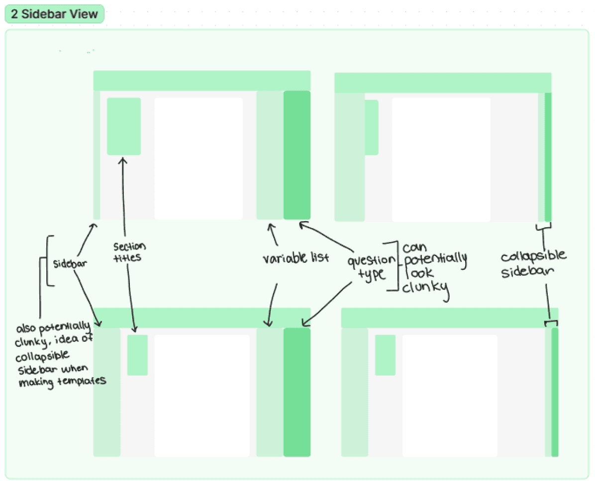

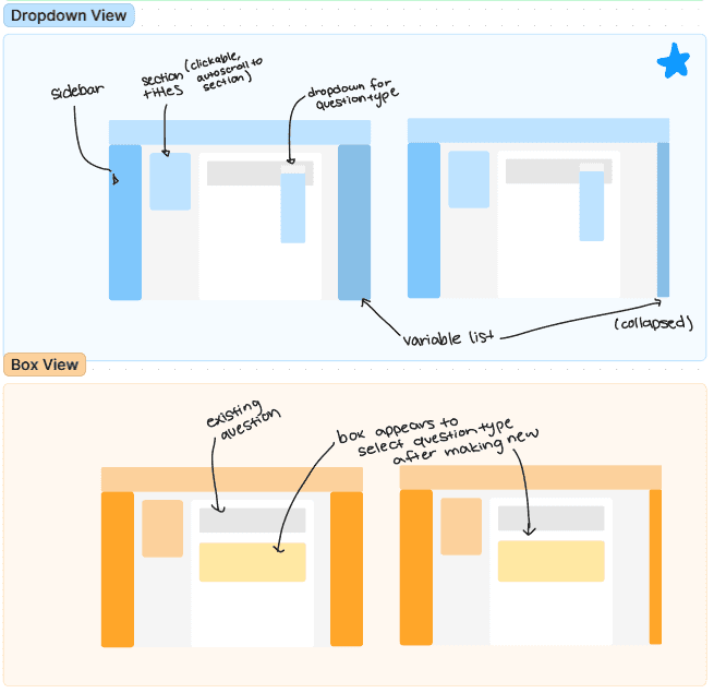

With the key points in mind, I created several extremely low-fidelity wireframe options to discuss with stakeholders and our fellow designers.
A key improvement was the progress tracker, enabling drag-and-drop question reordering for smoother navigation. I also added a movable toolbar, allowing users to create and delete questions anywhere in the form. Both features were well-received by stakeholders and users.
Ideation
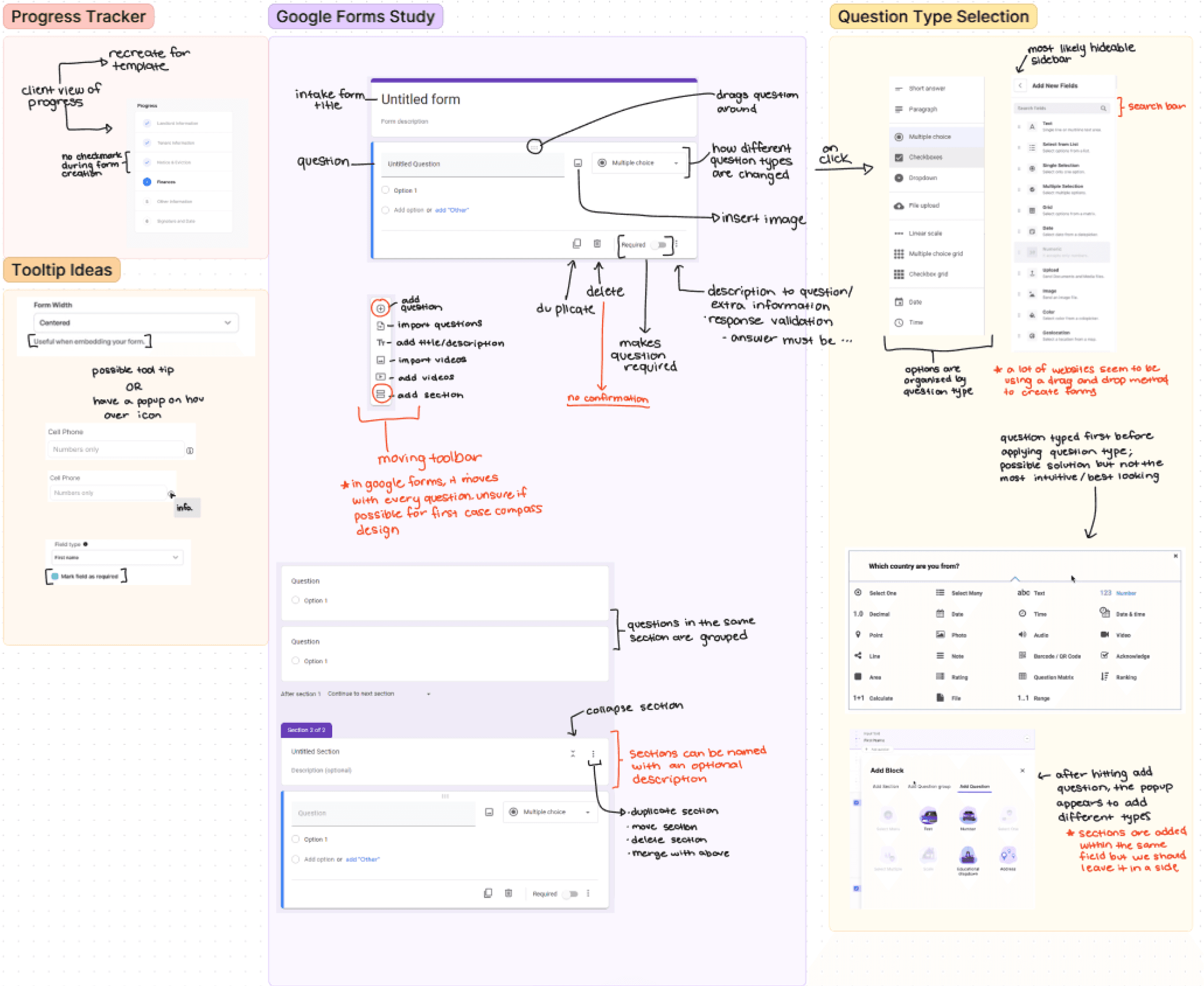
After gathering the necessary information, the next step was to conduct market research, focusing on key competitors like Google Forms. The effort was centered on examining essential features that should be incorporated into the final project.
My primary goal was to identify opportunities for improving the interface, making it more user-friendly and accessible for all users


Design
Wireframes
With the key points in mind, I created several extremely low-fidelity wireframe options to discuss with stakeholders and our fellow designers.
A key improvement was the progress tracker, enabling drag-and-drop question reordering for smoother navigation. I also added a movable toolbar, allowing users to create and delete questions anywhere in the form. Both features were well-received by stakeholders and users.
Blue star indicates the initial design settled on by the stockholders


Blue star indicates the initial design settled on by the stockholders


Refinement
The initial design featured a drop-down menu for changing question types, but after a follow-up meeting with the clients, a shift to a box-view design was suggested, as reflected in the low-fidelity wireframes.
The approach was quickly adapted to optimize the display of question types in this new format. Additionally, the progress tracker was modified to enhance accessibility, demonstrating flexibility in pivoting and improving designs based on evolving client needs and feedback
Final Designs
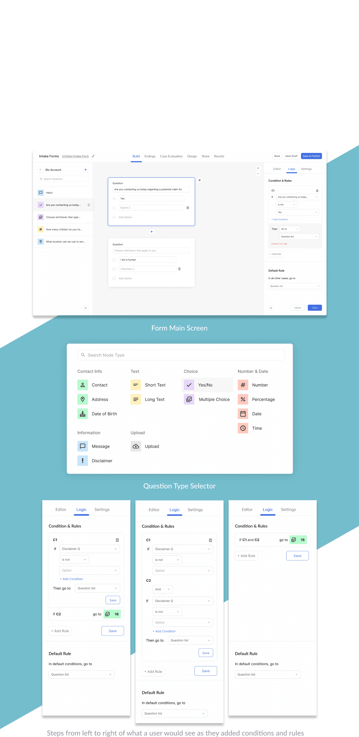


Final Designs
Reflections
Working on this project as a UX Engineer after starting as a Developer was an exciting and eye-opening experience. It deepened my understanding of the critical need for effective communication between teams, particularly between design and development, to ensure a cohesive and user-centered product.
I faced challenges diving into UX with no prior experience, but by staying adaptable, asking the right questions, and continuously learning, I found UX Engineering to be both enjoyable and rewarding.
Reflecting on the project, I see areas for improvement, especially in navigation, branching dialogue, and additional features that remain unexplored. As the project evolves within the company, I’m eager to continue refining it. Overall, this experience was a pivotal starting point in my journey as a UX Engineer, reinforcing the value of clear communication, adaptability, and open-mindedness in creating effective user-focused solutions.
Hi!
Thank you for making this far! If you want to learn more about me, please feel free to reach out!
Please check out my Resume as well!
Hi!
Thank you for making this far! If you want to learn more about me, please feel free to reach out!
Check out my Resume as well!
Hi!
Thank you for making this far! If you want to learn more about me, please feel free to reach out!
Please check out my Resume as well!