First Spark
Turning the invisible barriers of financial stability into visible opportunities for first-generation immigrants
scope
Designing a digital product that helps first-generation confidently navigate the U.S. financial system
role
User Research
Competitive Analysis
Prototyping
Information Architecture
tools
Figma
Miro
important links
team
Xin Yu Jiang, Arcadia Calimano, Arpitha Prasad
duration
13 Weeks
The Challenge
Our Solution
How might we help first-generation immigrants confidently learn and navigate the U.S. financial system?
First-generation immigrants often face difficulties when first approaching financial systems in the U.S., where unfamiliar terminology, fragmented resources, and a lack of accessible guidance can make even basic tasks overwhelming.
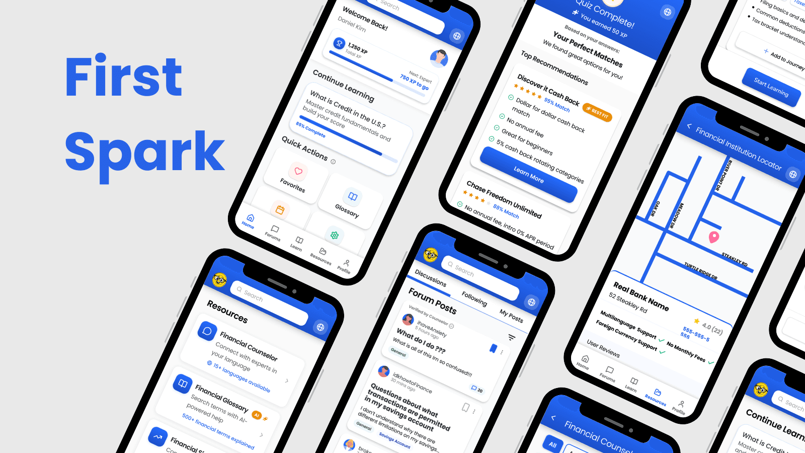
A gamified learning platform that simplifies financial systems through personalized onboarding, content support, and human support.
I conducted competitor research, led design for Home, Course Hub, and Forums, and defined key requirements such as legal compliance and trust. As a team, we conducted user interviews, worked on information architecture, and brainstorming initial wireframes.
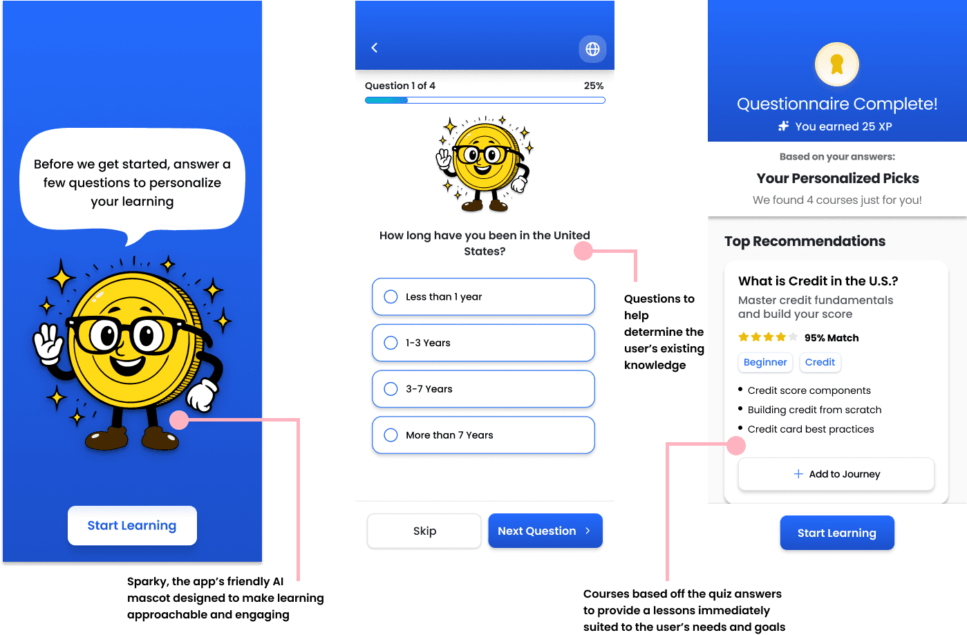
A personalized onboarding experience to find courses immediately related to the user's needs and goals
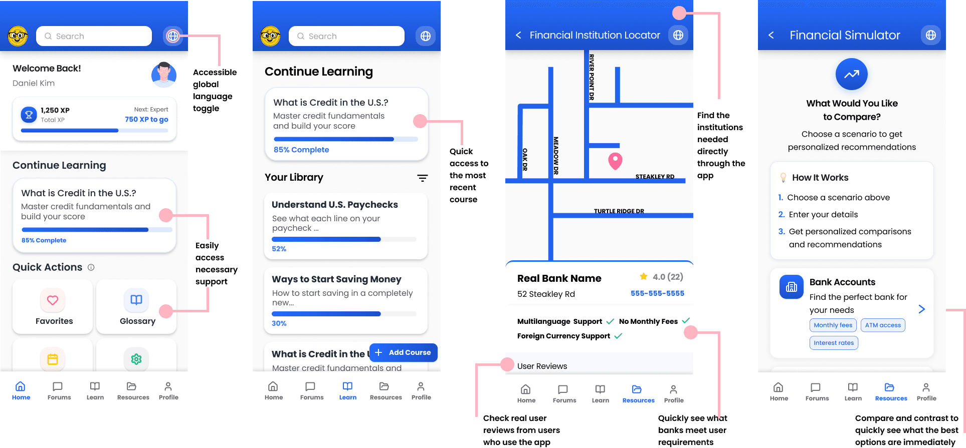
Easily accessible variety of content support including AI-assisted glossaries, multilingual toggles, and end of lesson quizzes
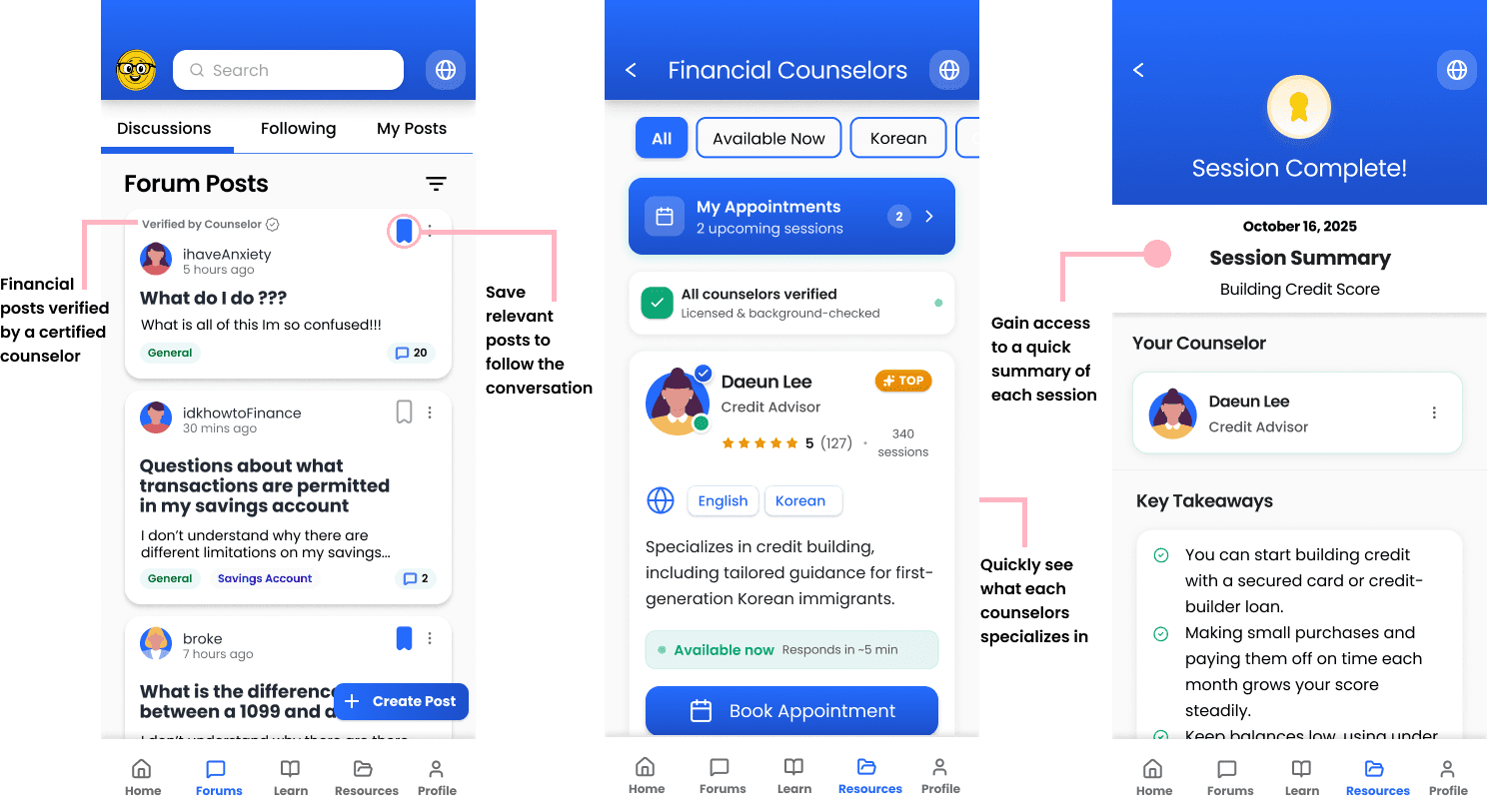
Providing community insight and culturally relevant counseling to guide users through financial challenges
User Research
Financial systems lack clear pathways for first-generation immigrants
We each conducted structured user interviews with first generation immigrants of varying backgrounds to better understand the different challenges they all faced.
From this, we were able to synthesize three key insights:
Lack of Financial Literacy
"I think the scariest part was not having the financial literacy to understand what I'm doing."
Insufficient Resources for Preparedness
"I didn't know where to look [for good resources] and didn't know which ones to trust."
Fear of Making Mistakes
"I was just worried that if I do something wrong... or get into legal trouble"
Ideating Concepts
Current learning tools were not designed for first-generation immigrant users
With core insights established, I conducted competitor research to validate that this concept addressed a real gap not met by existing financial tools.
Zogo: Learn and Earn
Pros
Finance-specific gamified application
Bite-sized lessons for easy learning
Based on real-world scenarios
Cons
Designed for global learning
Onboarding assumes digital literacy and familiarity with learning platforms
Classes are more academic or theoretically based
No practical tools
Duolingo
Pros
Languages, math, music, and chess lessons
Bite-sized lessons, all free
Fun characters
Playful rewards and achievements for motivation
Cons
Focused primarily on memorization and repetition
Streak-based motivation can be competitive and stressful
Coursera
Pros
A variety of courses in any category
Ability to download courses to study offline
Multilingual support with auto-translation built into the platform
Cons
Lack of multi-language support
Focused primarily on learning financial literacy, not navigating through the system
Unable to foster a community or get any peer support
We began generating design concepts for the project prompt, which I then organized into three distinct approaches, each addressing user needs through a different pathway.
Personalized Onboarding
Pain Points Addressed
Users did not know where or how to start finding resources.
Learning apps assumed familiarity with technical devices and immediately offers a wide range of courses
Insufficient Resources for Preparedness
Pain Points Addressed
Tutorials online were often written in English with minimal translation options
Users often had to search multiple websites in order to find the information they wanted
Results were sometimes wrong or used confusing unexplained jargon
Fear of Making Mistakes
Pain Points Addressed
Users wanted to hear real experiences from people instead of relying on tutorials
Some issues were too niche for tutorial articles to address
Users lacked a community they could reach out to for support

First Spark
Turning the invisible barriers of financial stability into visible opportunities for first-generation immigrants
scope
Designing a digital product that helps first-generation confidently navigate the U.S. financial system
role
User Research
Competitive Analysis
Prototyping
Information Architecture
tools
Figma
Miro
important links
team
Xin Yu Jiang, Arcadia Calimano, Arpitha Prasad
duration
13 Weeks
The Challenge
How might we help first-generation immigrants confidently learn and navigate the U.S. financial system?
First-generation immigrants often face difficulties when first approaching financial systems in the U.S., navigating unfamiliar terms, processes, and expectations without clear guidance or support. We were tasked with creating a product that could help alleviate this problem.
Our Solution
A gamified learning platform that simplifies complex financial systems through personalized onboarding, content support, and human support.
Our product focused around 3 core concepts:
A personalized onboarding experience to find courses immediately related to the user's needs and goals

Easily accessible variety of content support including AI-assisted glossaries, multilingual toggles, and end of lesson quizzes

Providing community insight and culturally relevant counseling to guide users through financial challenges

My Contributions
Conducted Competitor and Market Research
Led Design for Home, Course Hub, and Forums
Defined Key Requirements for Legal Compliance and Trust
The Result
We presented our work to a room of UX peers who evaluated our process and design rationale.
Feedback validated that guided flows and clear organization reduced confusion and improved task confidence, while revealing areas to iterate. By providing clear content organization and guided learning flows, the platform is projected to streamline financial learning, reduce user confusion, and support more confident task completion.
User Research
Financial systems lack clear pathways for first-generation immigrants
We each conducted structured user interviews with first generation immigrants of varying backgrounds to better understand the different challenges they all faced. Transcripts were organized into affinity maps and mental models.

From this, we were able to synthesize three key insights:
Lack of Financial Literacy
"I think the scariest part was not having the financial literacy to understand what I'm doing."
Insufficient Resources for Preparedness
"I didn't know where to look [for good resources] and didn't know which ones to trust."
Fear of Making Mistakes
"I was just worried that if I do something wrong... or get into legal trouble"
Ideating Concepts
Current learning tools were not designed for first-generation immigrant users
With core insights established, I conducted competitor research to validate that this concept addressed a real gap not met by existing financial tools.
Coursera
Pros
A variety of courses in any category
Ability to download courses to study offline
Multilingual support with auto-translation built into the platform
Cons
Lack of multi-language support
Focused primarily on learning financial literacy, not navigating through the system
Unable to foster a community or get any peer support
Zogo: Learn and Earn
Pros
Finance-specific gamified application
Bite-sized lessons for easy learning
Based on real-world scenarios
Cons
Designed for global learning
Onboarding assumes digital literacy and familiarity with learning platforms
Classes are more academic or theoretically based
No practical tools
Duolingo
Pros
Languages, math, music, and chess lessons
Bite-sized lessons, all free
Fun characters
Playful rewards and achievements for motivation
Cons
Focused primarily on memorization and repetition
Streak-based motivation can be competitive and stressful
Zogo: Learn and Earn
Pros
Finance-specific gamified application
Bite-sized lessons for easy learning
Based on real-world scenarios
Cons
Designed for global learning
Onboarding assumes digital literacy and familiarity with learning platforms
Classes are more academic or theoretically based
No practical tools
Duolingo
Pros
Languages, math, music, and chess lessons
Bite-sized lessons, all free
Fun characters
Playful rewards and achievements for motivation
Cons
Focused primarily on memorization and repetition
Streak-based motivation can be competitive and stressful
Coursera
Pros
A variety of courses in any category
Ability to download courses to study offline
Multilingual support with auto-translation built into the platform
Cons
Lack of multi-language support
Focused primarily on learning financial literacy, not navigating through the system
Unable to foster a community or get any peer support
We began generating design concepts for the project prompt, which I then organized into three distinct approaches, each addressing user needs through a different pathway.
Personalized Onboarding
Pain Points Addressed
Users did not know where or how to start finding resources.
Learning apps assumed familiarity with technical devices and immediately offers a wide range of courses
Insufficient Resources for Preparedness
Pain Points Addressed
Tutorials online were often written in English with minimal translation options
Users often had to search multiple websites in order to find the information they wanted
Results were sometimes wrong or used confusing unexplained jargon
Fear of Making Mistakes
Pain Points Addressed
Users wanted to hear real experiences from people instead of relying on tutorials
Some issues were too niche for tutorial articles to address
Users lacked a community they could reach out to for support
Defining Design Requirements
Designing for Finance cannot be done without considering Regulations and Trust
To guide the design process, I also established key requirements that shaped each concept, ensuring alignment with project goals and user research insights.
Be Transparent
For first-generation immigrants navigating U.S. financial systems, transparency is essential, users need to understand what the app does, why it’s safe, and how their data is used.
Speak Plainly
For first-generation immigrants navigating U.S. financial systems, transparency is essential, users need to understand what the app does, why it’s safe, and how their data is used.
Make it Trustworthy
To build trust with first-generation immigrants, we need to show verified, credible financial guidance and ensured compliance with Reg BI, making sources and credentials transparent and accessible.
Concepts to Product
Iterating Information Architecture to Prioritize What Matters
We went through several renditions of our information architecture in order to create one that would focus on our key concepts instead of focusing on creating the entire application.

Before
Too many unnecessary screens that did not focus around solving our problem statement.

After
An information architecture that focused on core screens to our problem.
I sketched out low-fidelity wireframes to explore structure, layout, and user flow, iterating after group feedback.


My initial Wireframes ( Top ) and Refined Wireframes after meeting with teammates ( Right )


Final Designs
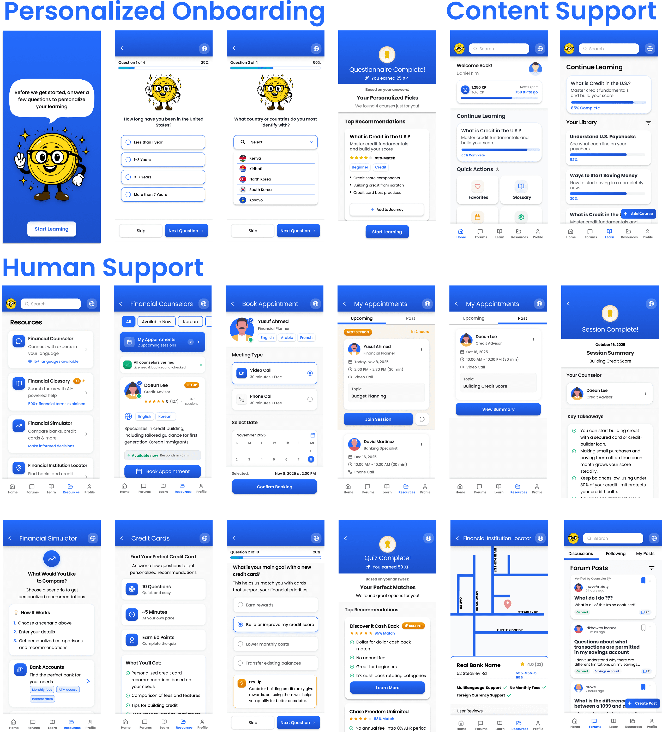
Turning Confusion to Confidence through our Final Product focused around Onboarding, Content, and Human Support
Our final wireframes with refined structure, navigation, and user flows, creating a cohesive experience with personalized onboarding, content support, and human support as core pathways.
We presented our work to a room of UX peers who evaluated our process and design rationale. Their feedback highlighted the strengths of our solution while also revealing new areas for us to keep iterating on.
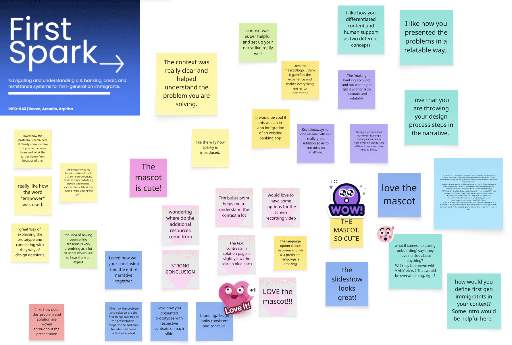
Live class feedback during our final presentation
We presented our work to a room of UX peers who evaluated our process and design rationale. Their feedback highlighted the strengths of our solution while also revealing new areas for us to keep iterating on.
Live class feedback during our final presentation
Reflections
Engaging isn't always Effective.
Usability testing revealed that elements we initially designed to feel “fun” or “interactive” often distracted users from completing key tasks, rather than supporting their understanding. Instead of enhancing the experience, these features introduced too much noise, pulling attention away from essential content and decision-making.
This insight shifted our approach, emphasizing clarity, guidance, and purposeful interaction over novelty, ensuring that every design element directly supported user learning and confidence.
For next time,
Our next steps would focus on expanding cultural inclusivity and ensuring the experience supports a broader range of users. This includes adding more language and cultural options, as well as transforming key components into fully functional, interactive features.
Reflections
Engaging isn't always Effective.
Usability testing revealed that elements we initially designed to feel “fun” or “interactive” often distracted users from completing key tasks, rather than supporting their understanding. Instead of enhancing the experience, these features introduced too much noise, pulling attention away from essential content and decision-making.
This insight shifted our approach, emphasizing clarity, guidance, and purposeful interaction over novelty, ensuring that every design element directly supported user learning and confidence.
For next time,
Our next steps would focus on expanding cultural inclusivity and ensuring the experience supports a broader range of users. This includes adding more language and cultural options, as well as transforming key components into fully functional, interactive features.
Additionally, conducting more extensive testing across diverse age groups, financial backgrounds, and levels of digital literacy would help ensure the design remains intuitive, equitable, and accessible for all users
Defining Design Requirements
Designing for Trust, Compliance, and Transparency
To guide the design process, I also established key requirements that shaped each concept, ensuring alignment with project goals and user research insights.
Be Transparent
For first-generation immigrants navigating U.S. financial systems, transparency is essential, users need to understand what the app does, why it’s safe, and how their data is used.
Speak Plainly
For first-generation immigrants navigating U.S. financial systems, transparency is essential, users need to understand what the app does, why it’s safe, and how their data is used.
Make it Trustworthy
To build trust with first-generation immigrants, we need to show verified, credible financial guidance and ensured compliance with Reg BI, making sources and credentials transparent and accessible.
Concepts to Product
Iterating Information Architecture to Prioritize What Matters
We went through several renditions of our information architecture in order to create one that would focus on our key concepts instead of focusing on creating the entire application.
Before
Too many unnecessary screens that did not focus around solving our problem statement.
After
An information architecture that focused on core screens to our problem.
I sketched out low-fidelity wireframes to explore structure, layout, and user flow, iterating after group feedback.
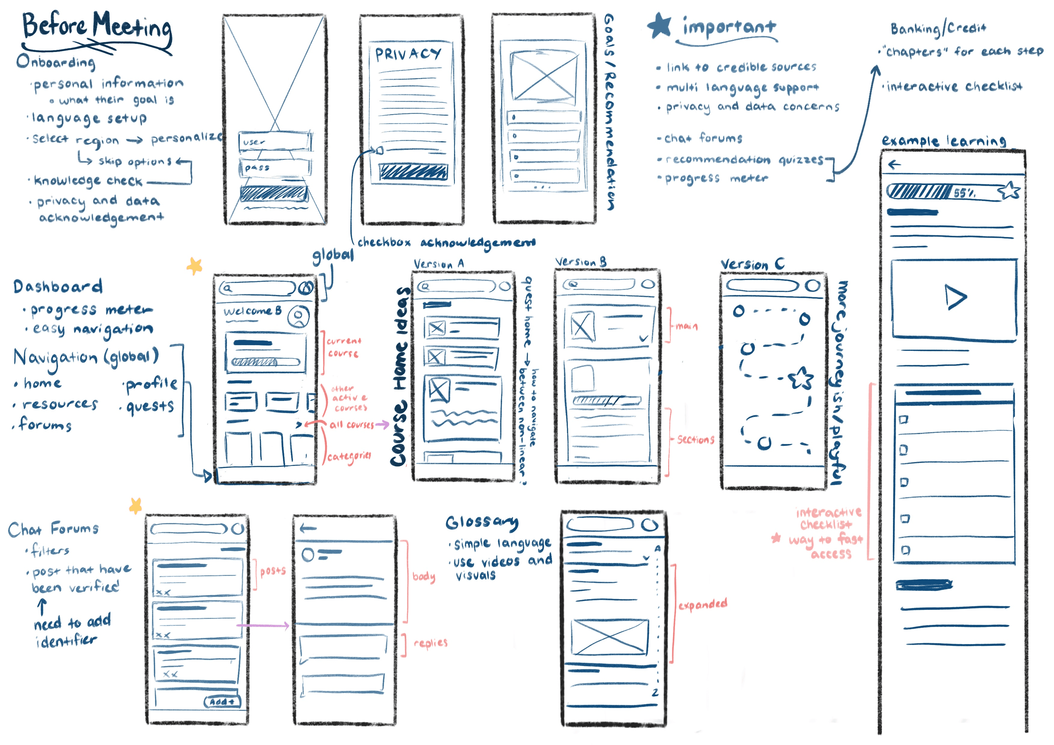
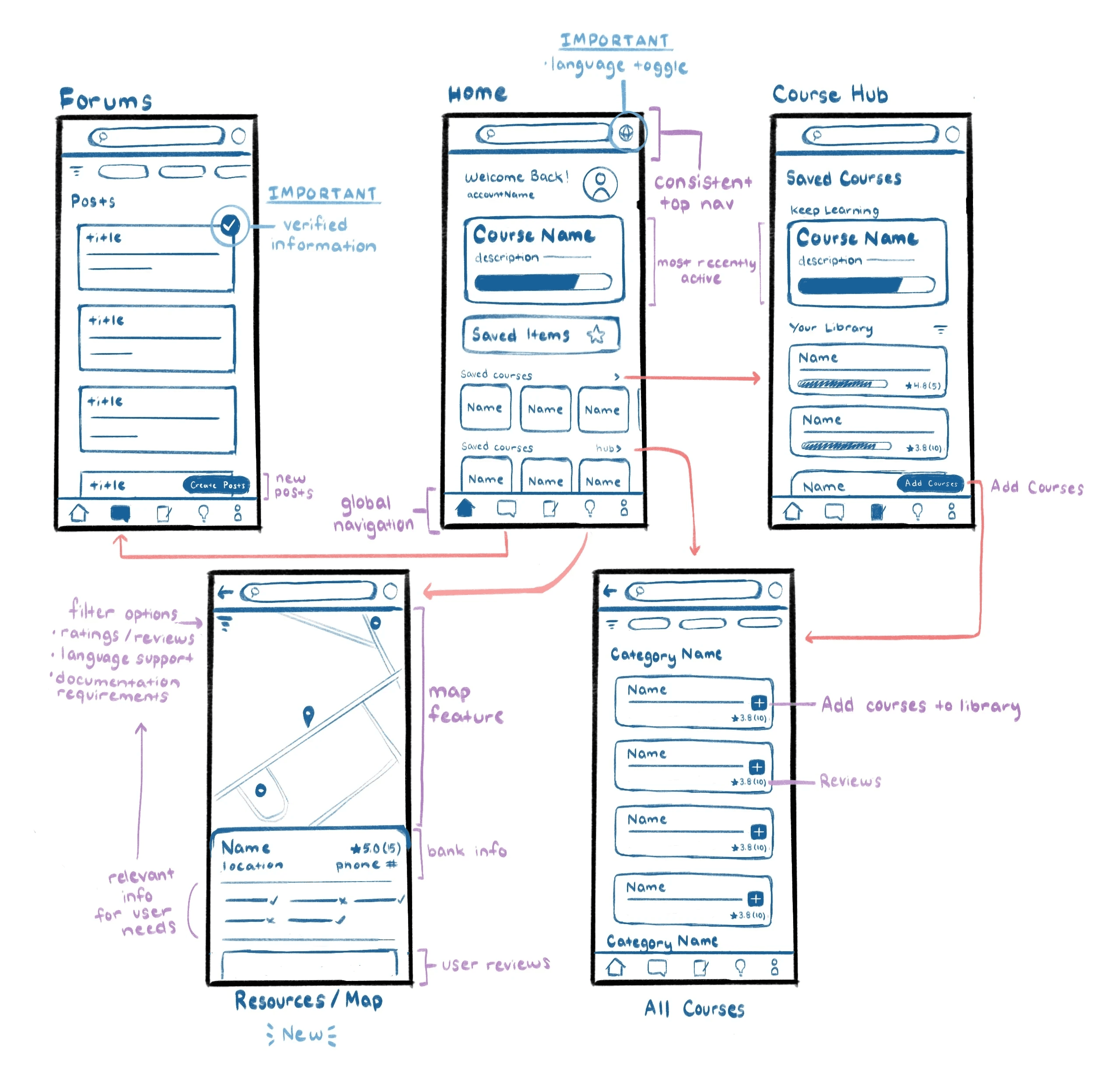
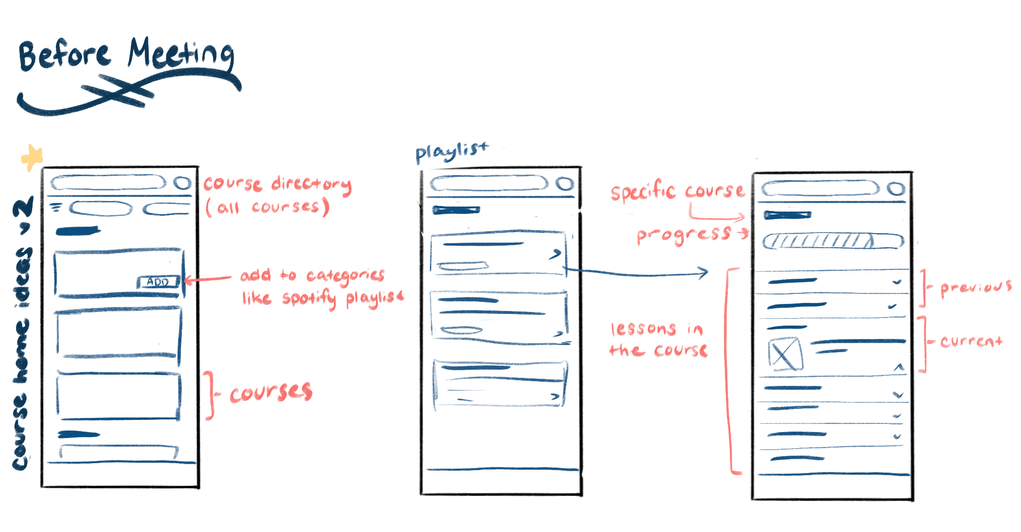

My initial Wireframes ( Left ) and Refined Wireframes after meeting with teammates ( Right )
Final Designs
Bringing core pathways together through our final product
Our final wireframes with refined structure, navigation, and user flows, creating a cohesive experience with personalized onboarding, content support, and human support as core pathways.
We presented our work to a room of UX peers who evaluated our process and design rationale. Their feedback highlighted the strengths of our solution while also revealing new areas for us to keep iterating on.
Live class feedback during our final presentation
Reflections
Engaging isn't always Effective.
Usability testing revealed that elements we initially designed to feel “fun” or “interactive” often distracted users from completing key tasks, rather than supporting their understanding. Instead of enhancing the experience, these features introduced too much noise, pulling attention away from essential content and decision-making.
This insight shifted our approach, emphasizing clarity, guidance, and purposeful interaction over novelty, ensuring that every design element directly supported user learning and confidence.
For next time,
Our next steps would focus on expanding cultural inclusivity and ensuring the experience supports a broader range of users. This includes adding more language and cultural options, as well as transforming key components into fully functional, interactive features.
Additionally, conducting more extensive testing across diverse age groups, financial backgrounds, and levels of digital literacy would help ensure the design remains intuitive, equitable, and accessible for all users