Inspired Minds Art Center
Discovering hidden barriers to engagement and creating clear pathways to programs and resources
scope
To uncover user pain points and improve the Inspired Minds Art Center website, making programs, events, and resources easier to access.
role
User Research
User Testing
Content Design
Information Architecture
tools
Figma
Miro
Private Panels
important links
team
Xin Yu Jiang, Vasilios Nikolopoulos, Danielle Stemper, and Kshitija Tammireddi
duration
4 Weeks
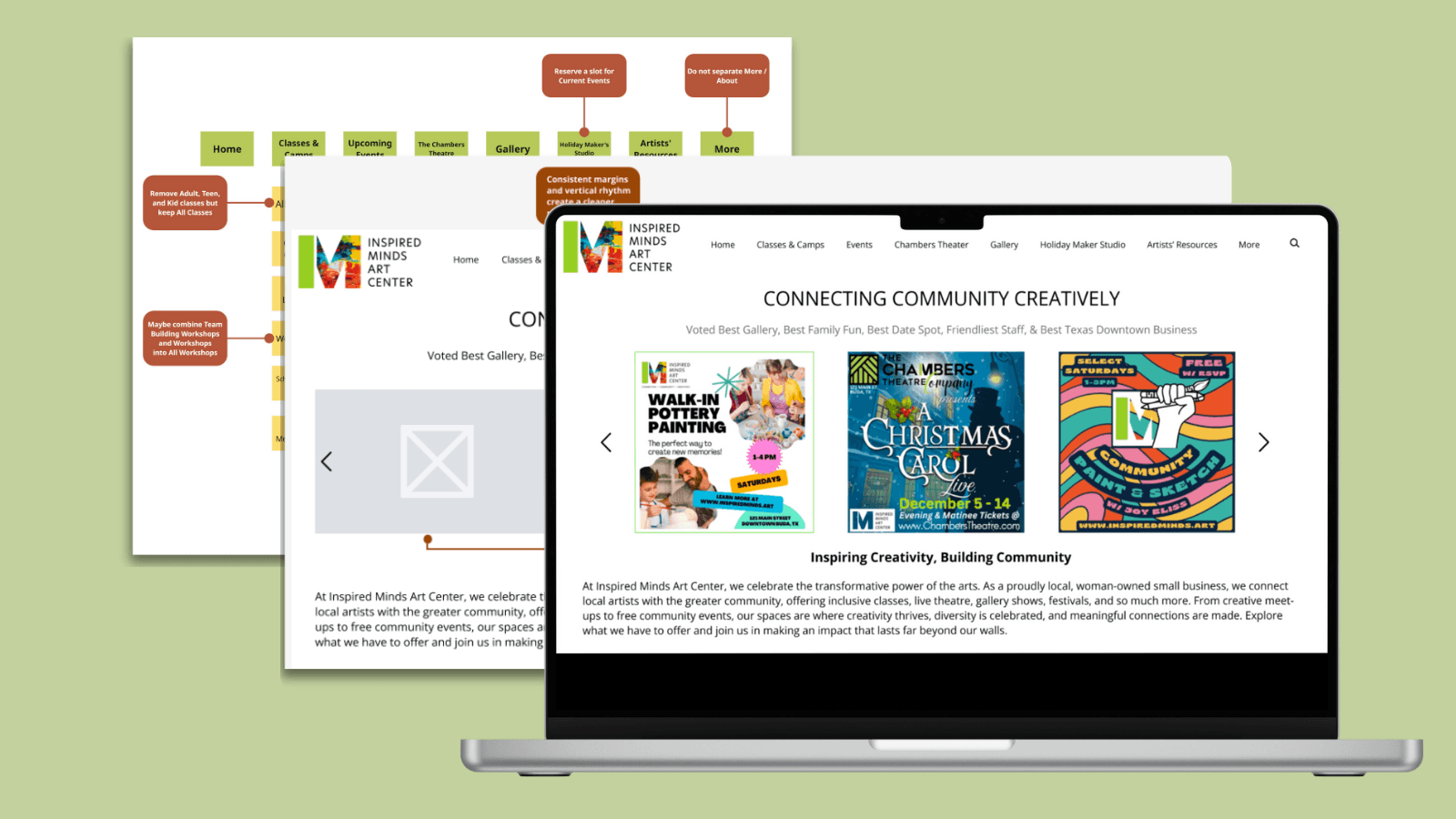
The Challenge
Our Solution
How might we reduce friction in navigation to help users locate the center’s resources quickly and confidently?
Users struggle to navigate the website and find the information they need, leading to frustration and repeated clicks. They needed a more modern, user-friendly design that allows all users to access content quickly, while also being easy to update and maintain.
Three recommendations focused on improving site architecture, navigation, and accessibility
I took ownership of the site map redesign, reorganizing the website’s structure to improve navigation and overall user experience. As a team, we conducted usability testing, accessibility audits, and stakeholder interviews.
Reduce visual clutter and improve clarity in the home page by moving non-essential elements in the header to the footer
Before
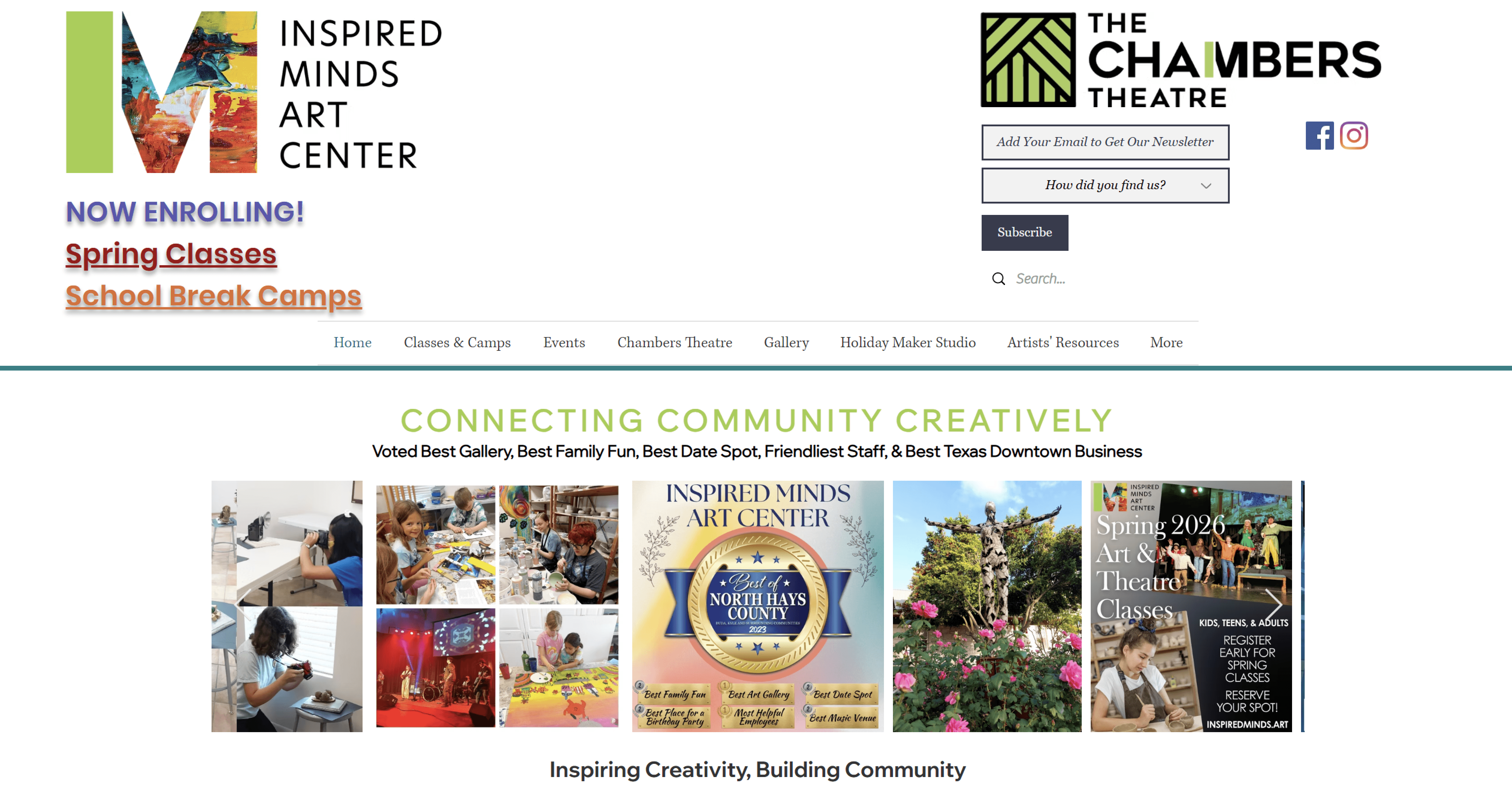
A cluttered header with different logos and a variety of information, creating noise.
After

A simplified header with a clear hierarchy and streamlined information, improving clarity and focus.
Cleaned up the website's information architecture and removed duplicate entries to allow for more intuitive navigation.
Before
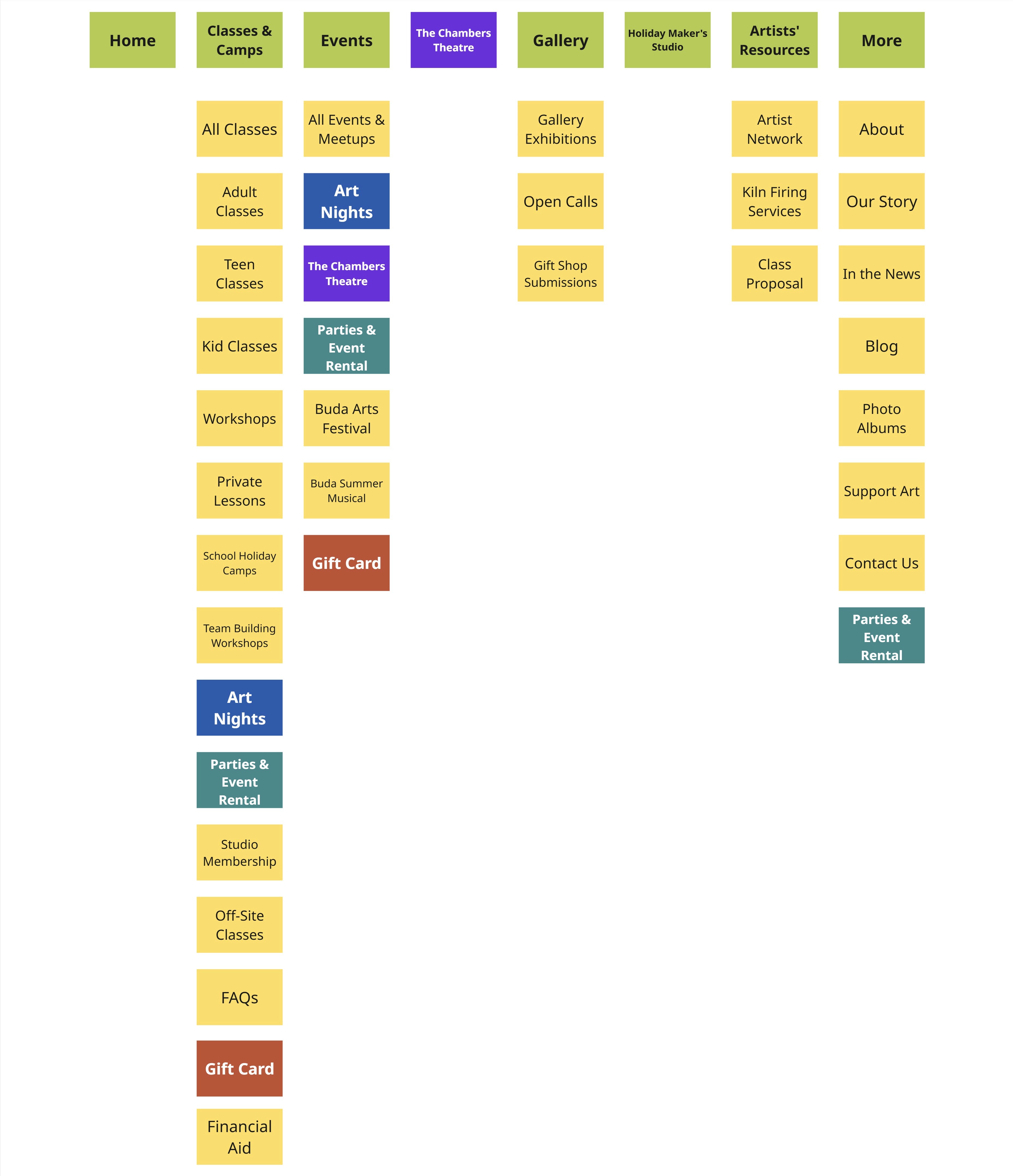
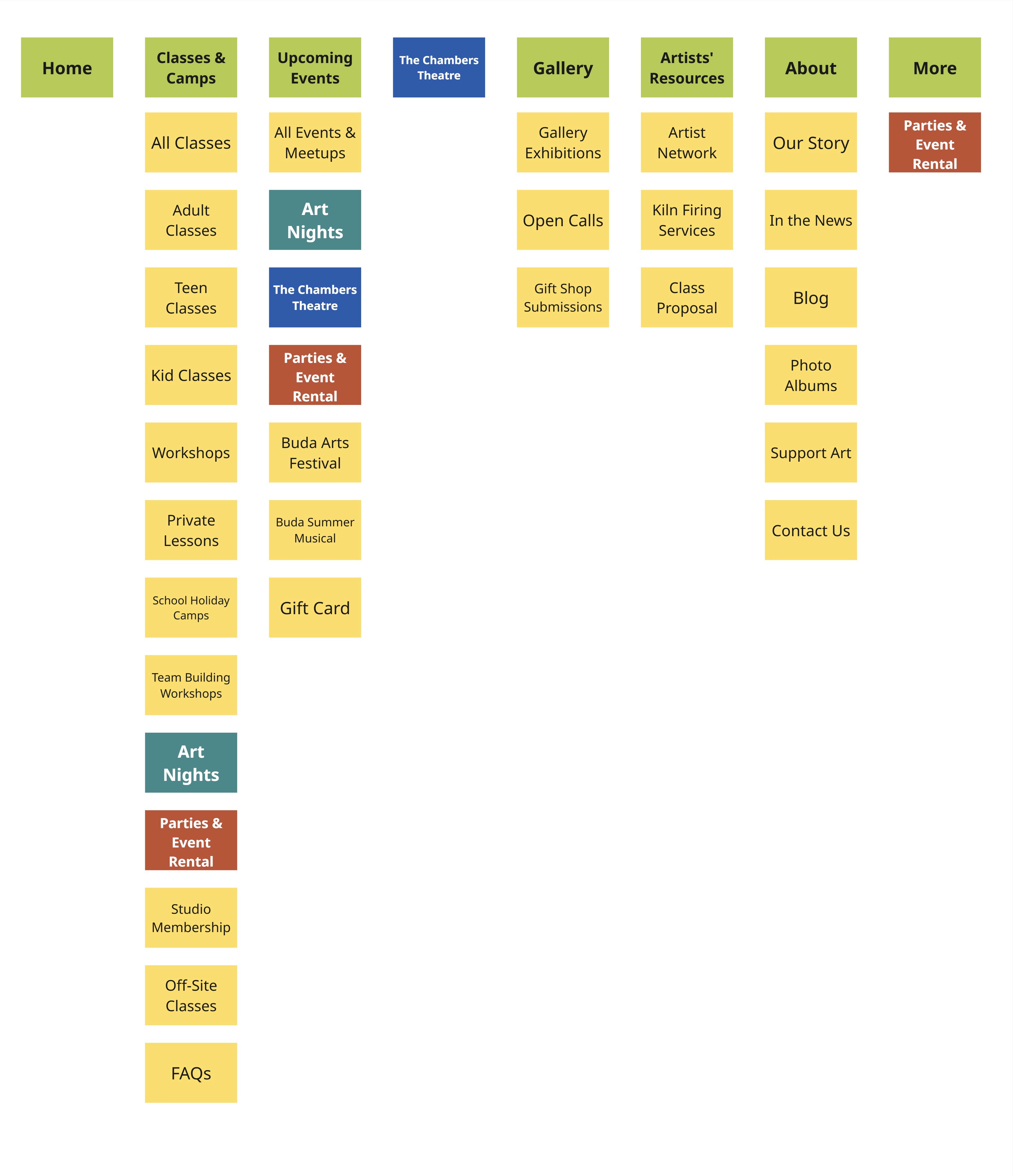
Their previous information architecture with duplicate entries in matching colors.
After
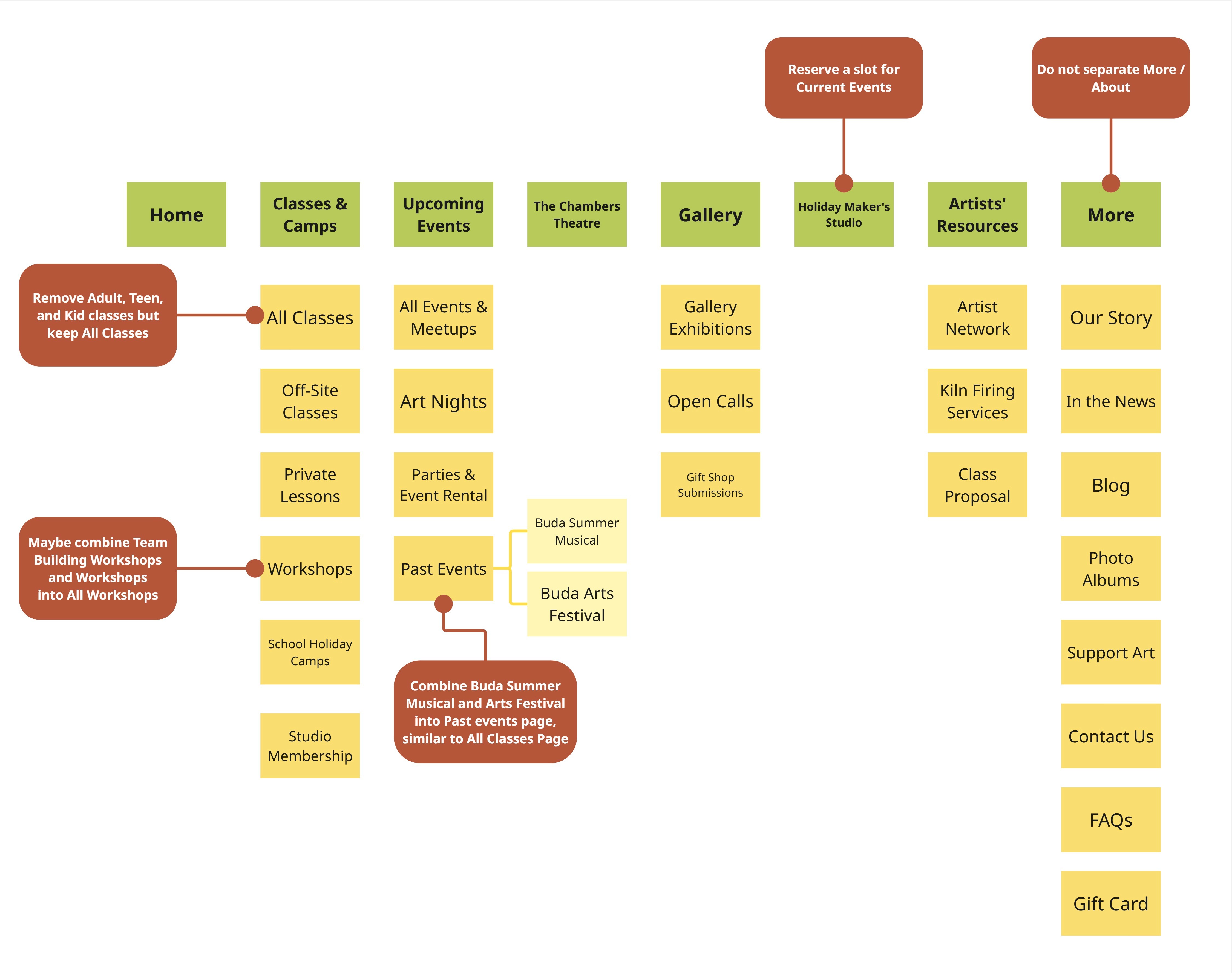
A more simplified information architecture with no duplicate entries and reorganized.
Increase font weight for key text elements and adjust the gray shades used on event cards to more visually accessible tones
Before
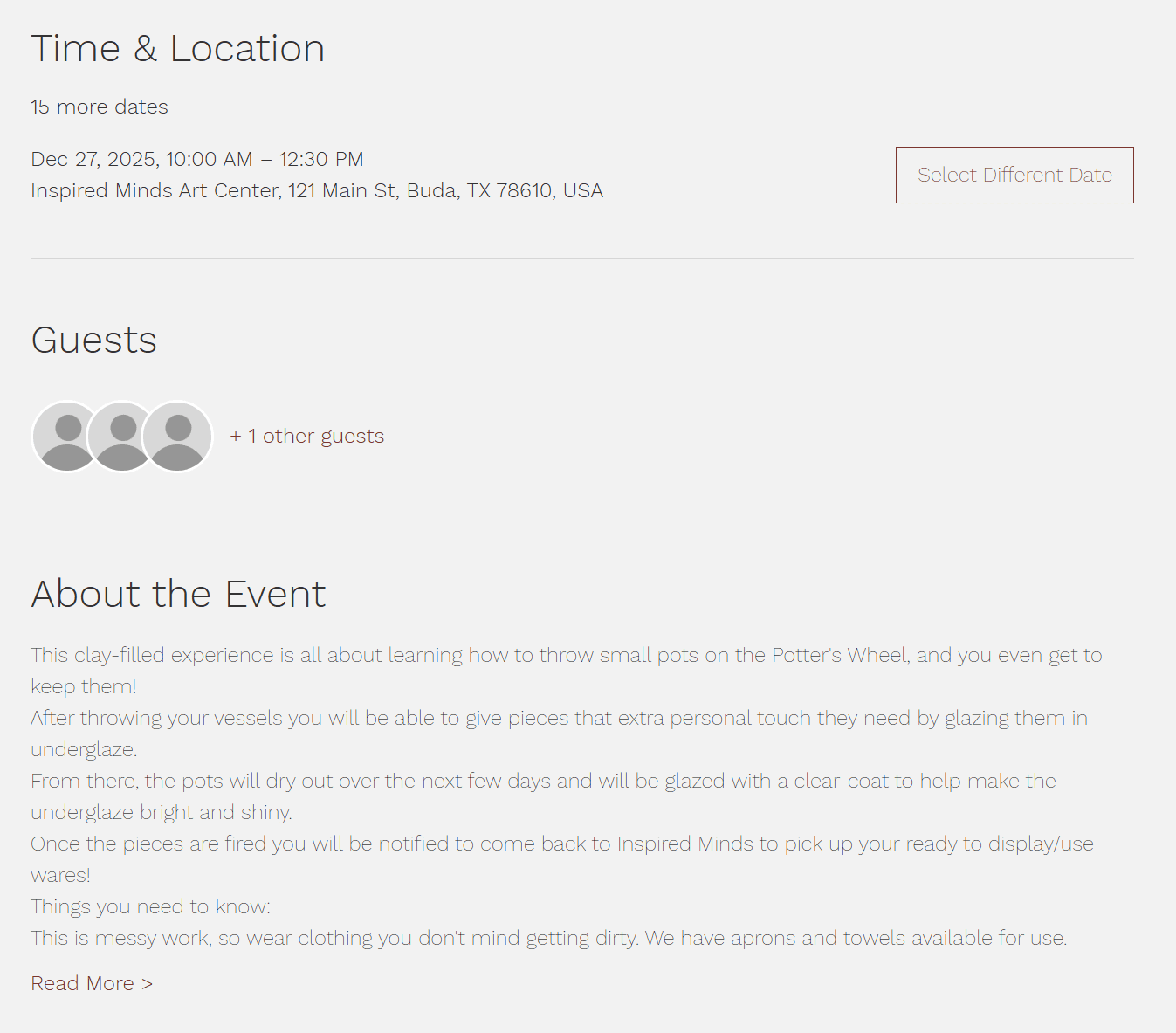
The events page, with hard to read text due to low accessibility between background color and text weight.
After
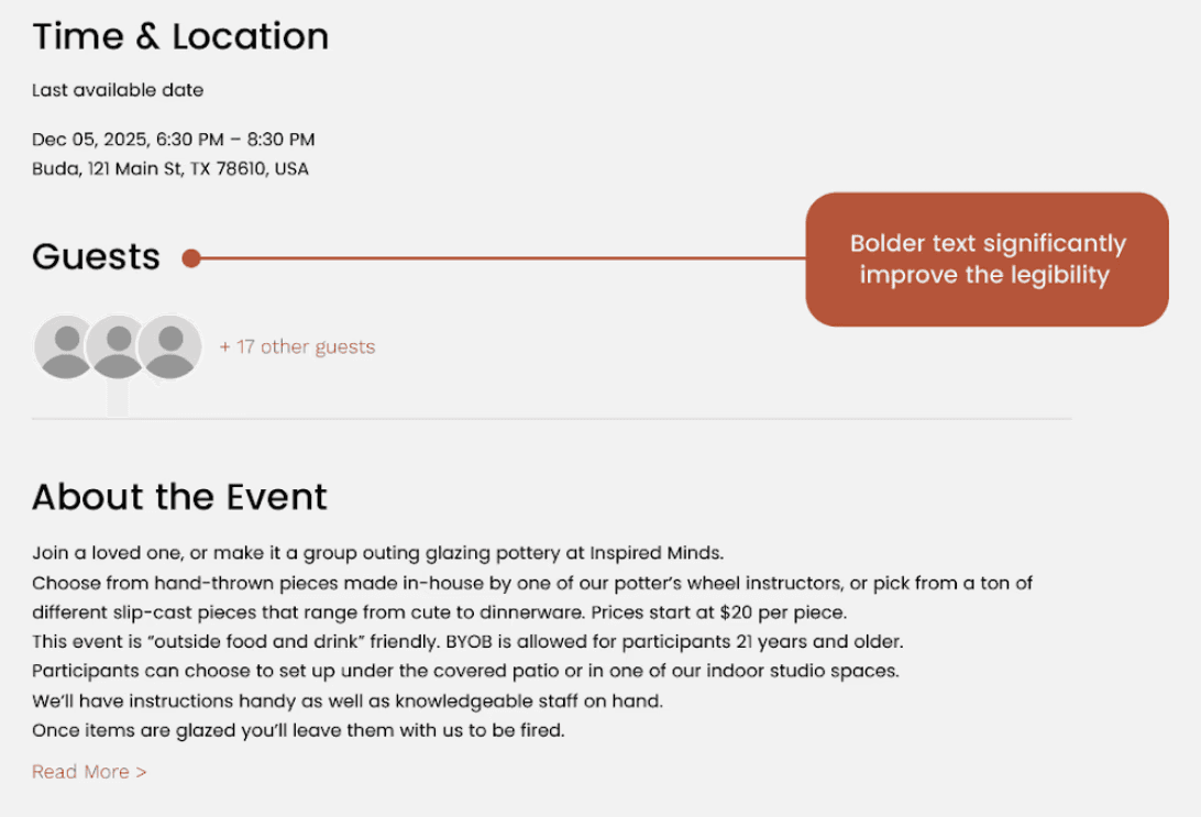
Increased font weight in order to increase legibility of text and accessibility.
The Result
Reduced navigation errors and improved information discoverability
By restructuring navigation and clarifying content pathways, users experienced fewer errors and faster access to information. This reduction in friction encouraged continued engagement, increasing user retention as users felt more confident navigating the site.
User Research
Clear Goals, No Clear Path: First Meeting Insights
During our initial client meeting, it became clear that the Inspired Minds Art Center team cared deeply about their website and were eager to improve it. They discussed ideas ranging from restructuring the site map and building a foundational design system to exploring a dashboard for visualizing key performance metrics.
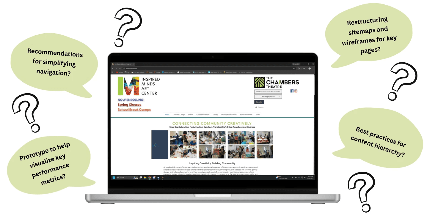
Given the limited time we had to spend with this project, we decided to narrow the scope to focus solely on usability. To maximize the impact of our work within the timeline, we clearly communicated this focus to the client, aligning expectations and establishing a shared understanding of what could realistically be achieved.
Moderated Usability Test
Learning from Users Navigating Without Clear Guidance
To better understand how users interact with the Inspired Minds Art Center website, we conducted a remote moderated usability test. Our goal was to uncover current pain points, so we designed a series of tasks and scenarios reflecting common actions a typical visitor might perform:
You have a friend visiting you this upcoming week who likes to attend art workshops. Find one and see when it starts (cost is not a concern).
Your neighbor mentioned that their teenage daughter is interested in taking a pottery wheel-throwing class. Check whether the Inspired Minds Art Center offers this class for non-adults.
You want to plan a fun night out with some friends, find out how the Inspired Minds Art Center might be able to accommodate this.
Find some upcoming musical events in December that you may be interested in.
You want to watch a theatre show. Find out when the next show is scheduled at the Inspired Minds Art Center.
Inspired Minds Art Center
Discovering hidden barriers to engagement and creating clear pathways to programs and resources
scope
To uncover user pain points and improve the Inspired Minds Art Center website, making programs, events, and resources easier to access.
role
User Research
User Testing
Content Design
Information Architecture
tools
Figma
Miro
Private Panels
important links
team
Xin Yu Jiang, Vasilios Nikolopoulos, Danielle Stemper, and Kshitija Tammireddi
duration
4 Weeks
The Challenge
How might we reduce friction in navigation to help users locate the center’s resources quickly and confidently?
Users struggle to navigate the website and find the information they need, leading to frustration and repeated clicks. They needed a more modern, user-friendly design that allows all users to access content quickly, while also being easy to update and maintain.
Our Solution
Three recommendations focused on improving site architecture, navigation, and accessibility
Reduce visual clutter and improve clarity in the home page by moving non-essential elements in the header to the footer
Before
A cluttered header with different logos and a variety of information, creating noise.
After
A simplified header with a clear hierarchy and streamlined information, improving clarity and focus.
Cleaned up the website's information architecture and removed duplicate entries to allow for more intuitive navigation.
Before
Their previous information architecture with duplicate entries in matching colors.
After
A more simplified information architecture with no duplicate entries and reorganized.
Increase font weight for key text elements and adjust the gray shades used on event cards to more visually accessible tones
Before
The events page, with hard to read text due to low accessibility between background color and text weight.
After
Increased font weight in order to increase legibility of text and accessibility.
My Contributions
I took ownership of the site map redesign, reorganizing the website’s structure to improve navigation and overall user experience. As a team, we conducted usability testing, accessibility audits, and stakeholder interviews.
The Result
Reduced navigation errors and improved information discoverability
By restructuring navigation and clarifying content pathways, users experienced fewer errors and faster access to information. This reduction in friction encouraged continued engagement, increasing user retention as users felt more confident navigating the site.
As of now, our changes have been fully implemented on their website!
Initial Scope
Clear Goals, No Clear Path: First Meeting Insights
During our initial client meeting, it became clear that the Inspired Minds Art Center team cared deeply about their website and were eager to improve it. They discussed ideas ranging from restructuring the site map and building a foundational design system to exploring a dashboard for visualizing key performance metrics.
Given the limited time we had to spend with this project, we decided to narrow the scope to focus solely on usability. To maximize the impact of our work within the timeline, we clearly communicated this focus to the client, aligning expectations and establishing a shared understanding of what could realistically be achieved.
Moderated Usability Test
Learning from Users Navigating Without Clear Guidance
To better understand how users interact with the Inspired Minds Art Center website, we conducted a remote moderated usability test. Our goal was to uncover current pain points, so we designed a series of tasks and scenarios reflecting common actions a typical visitor might perform:
You have a friend visiting you this upcoming week who likes to attend art workshops. Find one and see when it starts (cost is not a concern).
Your neighbor mentioned that their teenage daughter is interested in taking a pottery wheel-throwing class. Check whether the Inspired Minds Art Center offers this class for non-adults.
You want to plan a fun night out with some friends, find out how the Inspired Minds Art Center might be able to accommodate this.
Find some upcoming musical events in December that you may be interested in.
You want to watch a theatre show. Find out when the next show is scheduled at the Inspired Minds Art Center.
Participant Profiles
Finding Participants that Reflect Typical Website Visitors
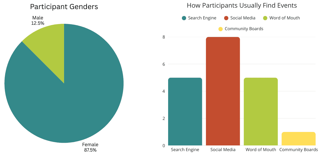
In total, we conducted 8 moderated usability tests. Participants were screened to have a general interest in arts to reflect the target audience of the website. Additionally, we also asked how they usually located art related events to better understand their previous experience coming into our testing.
Our final participants were mainly female, between the ages of 25-34.
Overall Findings
Fun Events Overshadowed by Information Overload and Repetitive Navigation
Overall, participants responded positively to the quality of content on the website and found the events fun and engaging. However, analysis of our usability test notes revealed core usability issues that were consistently highlighted across multiple user sessions:
Difficulty Finding Information
Participants frequently struggled to find information, often feeling overwhelmed by numerous navigation paths and dense visual layouts on key pages.
Navigation Overload
Excessive drop-down menus and unclear pathways increased search time and led to confusion.
Readability Struggles
Thin font sizes and low-contrast text made content harder to read and scan across multiple pages.
From these key issues, we developed design recommendations that would align with our clients goals. I took ownership of the site map redesign, reorganizing the website’s structure to improve navigation and overall user experience.
Overwhelming Landing Pages
The organization of the landing page confused users and left them lost on where to go.
When participants first opened the website, they were quickly overwhelmed by the amount of information on the landing page.
“I think my immediate comments are just that there are way too many things you can select from the homepage, I think it needs to do a better job consolidating that and helping point you where you need to go.” - Participant
Default landing page displaying overwhelming information in header.
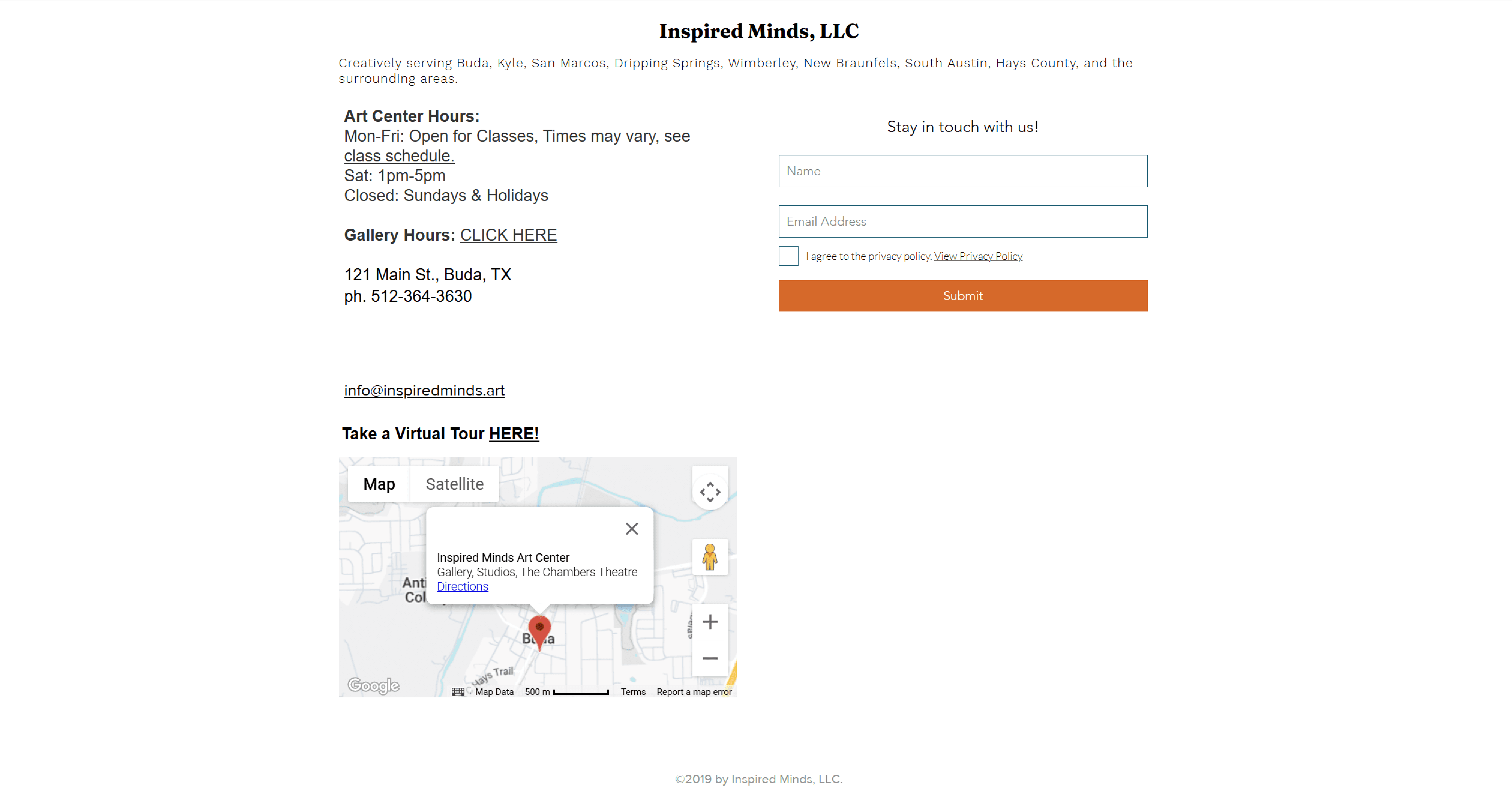
Users were also confused by the oversized footer, unsure whether it marked the end of the page or was part of the main content.
DBE3AF
Footer, Screenshot taken at 75% in order to capture the full footer
Cleaning up First
Impressions
Reduce visual clutter and improve clarity; Move non-essential elements in the header to the footer
We simplified the landing page by reducing visual clutter and reorganizing the header and footer, allowing the header to clearly guide users and freeing up space for meaningful content. The carousel was standardized with consistent image sizes to improve readability and visual cohesion.
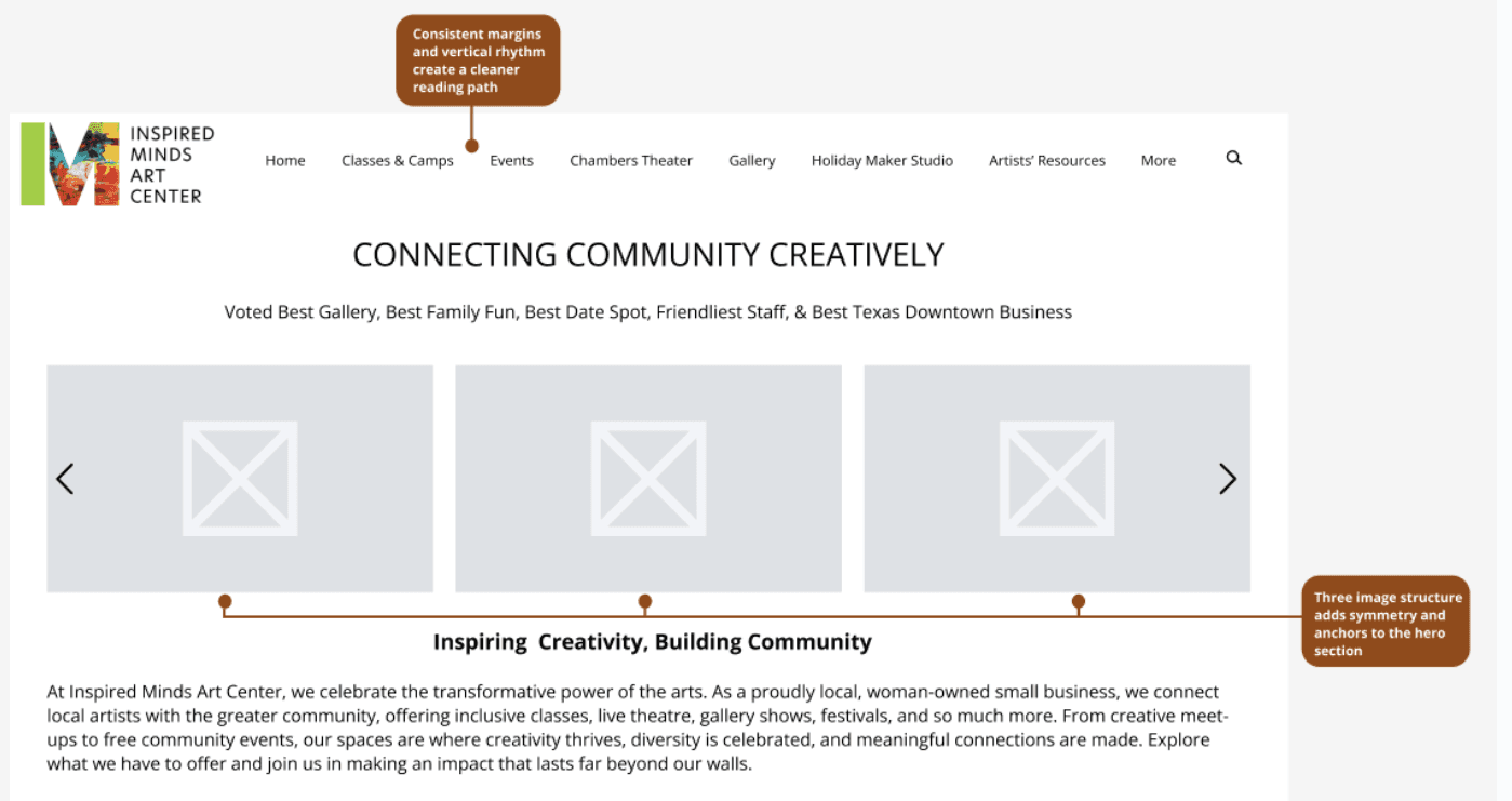
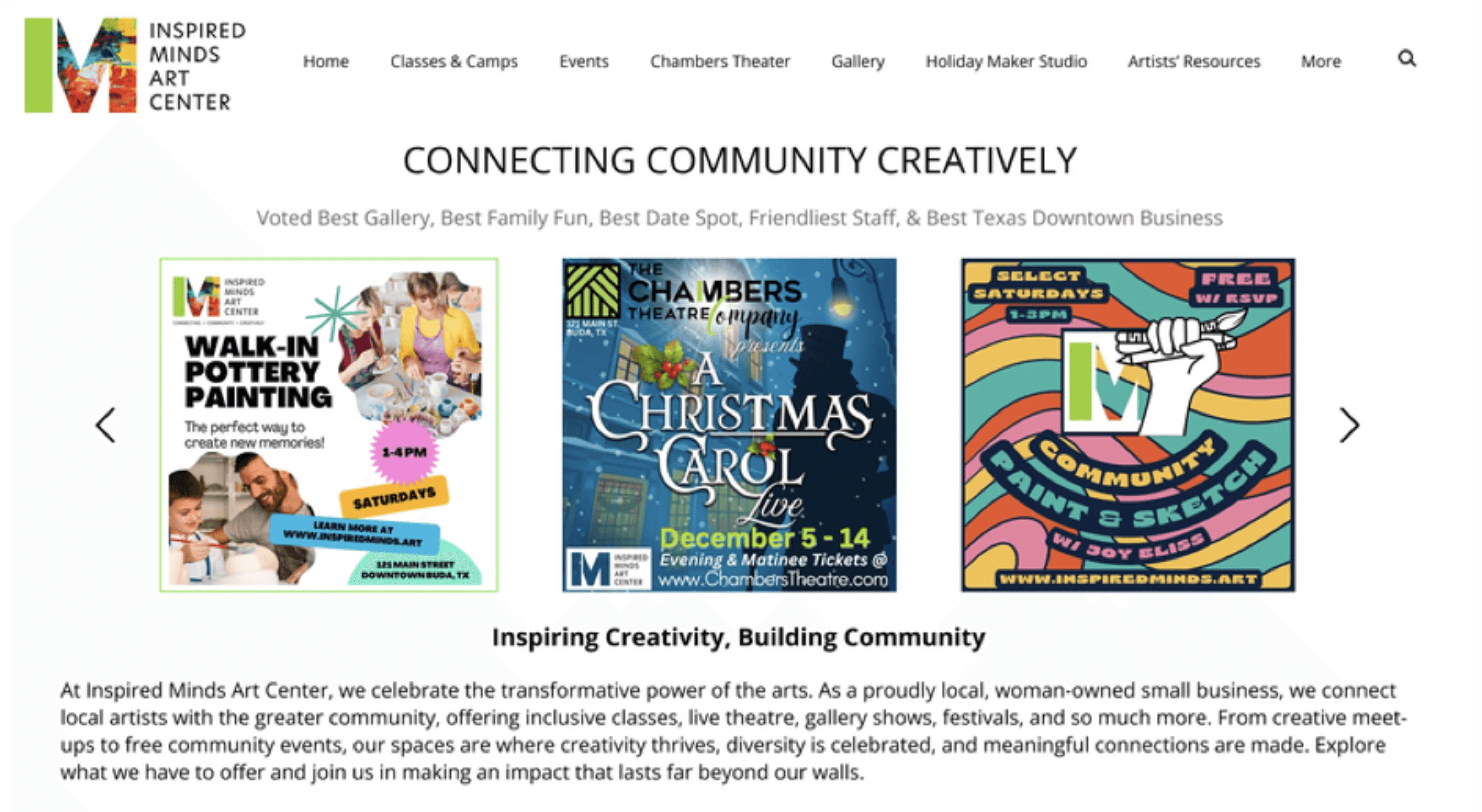
Default landing page displaying overwhelming information in header.
The footer was redesigned to highlight key elements and make better use of space while supporting easy navigation.
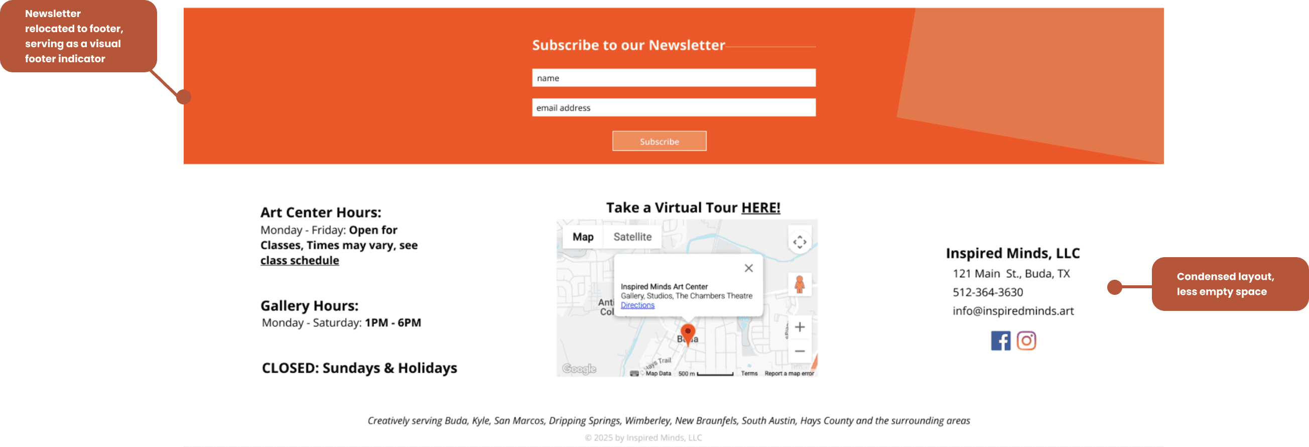
Arrangement of information and increased negative space in the footer to improve scan-ability and visual clarity.
Confusing Navigation
Navigation dropdowns were excessive and often had duplicate entries in multiple locations.
The site’s repetitive content and numerous navigation paths made participants feel lost and forced them to spend excessive time digging through dropdown menus to find specific information.
“I don't think there is a point to having all of these tabs [in the navigating bar drop-down menus]...some of them are kind of redundant, I don't see why ‘Chambers Theater’ [in the navigation bar] is different from ‘Chambers Theater’ under ‘Events’. ” - Participant
Default landing page displaying overwhelming information in header.
5 out of 8 participants wanted a cleaner navigation system.
Sitemap with and without Current Events, Duplicate entries in matching color
Reorganizing for Usability
Remove duplicate items from drop-down menus and reorganize the navigation structure for a more intuitive experience
We recommended simplifying the navigation menu by consolidating and removing duplicate options. Long dropdowns had overwhelmed participants, so we reorganized the structure by relocating duplicates and grouping overly specific items into broader, more intuitive categories.
My proposed restructured sitemap with a focus on improving user experience
Legibility and Accessibility Challenges
Users struggled with readability and accessibility across the site, making it difficult to find relevant information.
When searching each page for the relevant information, participants found the text difficult to read and skim.
“I will say just in general, it was a little hard to read…it was great to see what event it was but it's so small. I don’t really know how to describe it but its gray on gray and its really really thin.” - Participant
6 out of 8 participants struggled with legibility across pages.
Event Details Page with difficult to read information
Designing for Accessibility
Increase font weight for key text elements and adjust the gray shades used on event cards to more visually accessible tones.
The issue of legibility can be fixed by increasing the contrast between the text and the background, especially for key information such as event titles, dates, and headings. We recommend increasing the font weight and color for text elements to make them more prominent and easier to scan.
Proposed simple yet effective accessibility changes
Reflections
Maintain Communication.
Clear communication throughout the project played a critical role in preventing misalignment and keeping both the team and stakeholders aligned on shared goals. Regular check-ins, open discussions, and consistent updates ensured that ideas, feedback, and decisions were clearly understood across all parties. Communicating with stakeholders early and often helped validate direction, manage expectations, and incorporate feedback before issues became costly to address.
This alignment allowed the team to move more efficiently, especially during key phases like ideation and iteration. Reflecting on the process, it became clear that strong communication not only improved collaboration but also strengthened trust with stakeholders and contributed directly to a more cohesive, well-informed final outcome.
For next time,
Due to the limited timeline, we were unable to explore usability improvements as extensively as we would have liked. Given more time, I would definitely want to focus on testing for mobile optimization.
We only realized in our presentation that we had completely neglected thoughts of optimization on other screen sizes. While we did not have the time to do so, I would love to look at this as a future opportunity.
Reflections
Maintain Communication.
Clear communication throughout the project played a critical role in preventing misalignment and keeping both the team and stakeholders aligned on shared goals. Regular check-ins, open discussions, and consistent updates ensured that ideas, feedback, and decisions were clearly understood across all parties. Communicating with stakeholders early and often helped validate direction, manage expectations, and incorporate feedback before issues became costly to address.
This alignment allowed the team to move more efficiently, especially during key phases like ideation and iteration. Reflecting on the process, it became clear that strong communication not only improved collaboration but also strengthened trust with stakeholders and contributed directly to a more cohesive, well-informed final outcome.
For next time,
Due to the limited timeline, we were unable to explore usability improvements as extensively as we would have liked. Given more time, I would definitely want to focus on testing for mobile optimization.
We only realized in our presentation that we had completely neglected thoughts of optimization on other screen sizes. While we did not have the time to do so, I would love to look at this as a future opportunity.
Participant Profiles
Finding Participants that Reflect Typical Website Visitors
In total, we conducted 8 moderated usability tests. Participants were screened to have a general interest in arts to reflect the target audience of the website. Additionally, we also asked how they usually located art related events to better understand their previous experience coming into our testing.
Our final participants were mainly female, between the ages of 25-34.
Overall Findings
Fun Events Overshadowed by Information Overload and Repetitive Navigation
Overall, participants responded positively to the quality of content on the website and found the events fun and engaging. However, analysis of our usability test notes revealed core usability issues that were consistently highlighted across multiple user sessions:
From these key issues, we developed design recommendations that would align with our clients goals. I took ownership of the site map redesign, reorganizing the website’s structure to improve navigation and overall user experience.
Difficulty Finding Information
Participants frequently struggled to find information, often feeling overwhelmed by numerous navigation paths and dense visual layouts on key pages.
Navigation Overload
Excessive drop-down menus and unclear pathways increased search time and led to confusion.
Readability Struggles
Thin font sizes and low-contrast text made content harder to read and scan across multiple pages.
Key Issues and Recommendations
Overwhelming Landing Pages, Confusing Navigation, and Legibility Challenges
Issue 1: Overwhelming Landing Pages
When participants first opened the website, they were quickly overwhelmed by the amount of information on the landing page. While they appreciated the event carousel, inconsistent image sizes created visual clutter.
“I think my immediate comments are just that there are way too many things you can select from the homepage, I think it needs to do a better job consolidating that and helping point you where you need to go.” - Participant
Figure 3. Default landing page displaying overwhelming information in header.
Users were also confused by the oversized footer, unsure whether it marked the end of the page or was part of the main content.
Figure 4. Footer, Screenshot taken at 75% in order to capture the full footer
Recommendation
Reduce visual clutter and improve clarity; Move non-essential elements in the header to the footer
We simplified the landing page by reducing visual clutter and reorganizing the header and footer, allowing the header to clearly guide users and freeing up space for meaningful content. The carousel was standardized with consistent image sizes to improve readability and visual cohesion.
Figure 5. Our Mockup for the Landing Page with a focus on Clarity
The footer was redesigned to highlight key elements and make better use of space while supporting easy navigation.
Figure 6. Arrangement of information and increased negative space in the footer to improve scannability and visual clarity.
Issue 2: Confusing Navigation
The site’s repetitive content and numerous navigation paths made participants feel lost and forced them to spend excessive time digging through dropdown menus to find specific information.
“I don't think there is a point to having all of these tabs [in the navigating bar drop-down menus]...some of them are kind of redundant, I don't see why ‘Chambers Theater’ [in the navigation bar] is different from ‘Chambers Theater’ under ‘Events’. ” - Participant
5 out of 8 participants wanted a cleaner navigation system.
Figure 7. Sitemap with and without Current Events, Duplicate entries in matching color
Recommendation
Remove duplicate items from drop-down menus and reorganize the navigation structure for a more intuitive experience
We recommended simplifying the navigation menu by consolidating and removing duplicate options. Long dropdowns had overwhelmed participants, so we reorganized the structure by relocating duplicates and grouping overly specific items into broader, more intuitive categories.
Figure 8. My proposed restructured sitemap with a focus on improving user experience
Issue 3: Legibility and Accessibility Challenges
When searching each page for the relevant information, participants found the text difficult to read and skim.
“I will say just in general, it was a little hard to read…it was great to see what event it was but it's so small. I don’t really know how to describe it but its gray on gray and its really really thin.”
- Participant
6 out of 8 participants struggled with legibility across pages.
Figure 9. Event Details Page with difficult to read information
Recommendation
Increase font weight for key text elements and adjust the gray shades used on event cards to more visually accessible tones.
The issue of legibility can be fixed by increasing the contrast between the text and the background, especially for key information such as event titles, dates, and headings. We recommend increasing the font weight and color for text elements to make them more prominent and easier to scan.
Figure 10. Proposed simple yet effective accessibility changes
Reflections
Maintain Communication.
Clear communication throughout the project played a critical role in preventing misalignment and keeping both the team and stakeholders aligned on shared goals. Regular check-ins, open discussions, and consistent updates ensured that ideas, feedback, and decisions were clearly understood across all parties. Communicating with stakeholders early and often helped validate direction, manage expectations, and incorporate feedback before issues became costly to address.
This alignment allowed the team to move more efficiently, especially during key phases like ideation and iteration. Reflecting on the process, it became clear that strong communication not only improved collaboration but also strengthened trust with stakeholders and contributed directly to a more cohesive, well-informed final outcome.
For next time,
Due to the limited timeline, we were unable to explore usability improvements as extensively as we would have liked. Given more time, I would definitely want to focus on testing for mobile optimization.
We only realized in our presentation that we had completely neglected thoughts of optimization on other screen sizes. While we did not have the time to do so, I would love to look at this as a future opportunity