
Purrfect Match
A compatibility-focused pet adoption experience designed to create more authentic matches.
scope
Designing a warm and transparent adoption experience that helps users find compatible pets.
role
User Research
Visual Design
Prototyping
Information Architecture
tools
Figma
Miro
important links
team
3 Product Designers
duration
13 Weeks
The Challenge
How might we help potential adopters get matched with pets that are highly-compatible to their needs and lifestyle?
Our Solution
Nearly 6 million animals enter U.S. shelters each year, yet 1 in 5 adopted pets are returned because the match wasn’t the right fit. Potential pet owners need a smarter way to find a pet that truly matches their preferences and lifestyle.
Purrfect Match, a compatibility focused product to connect users with pets that are fit their needs, habits, and lifestyle.
Start with an onboarding quiz in order to determine your initial preferences for pets.
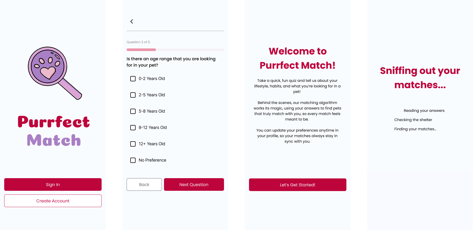
Browse through multiple ways to discover an ideal pet, including a swipe and search system. Compare your compatibility with every pet you discover and more.

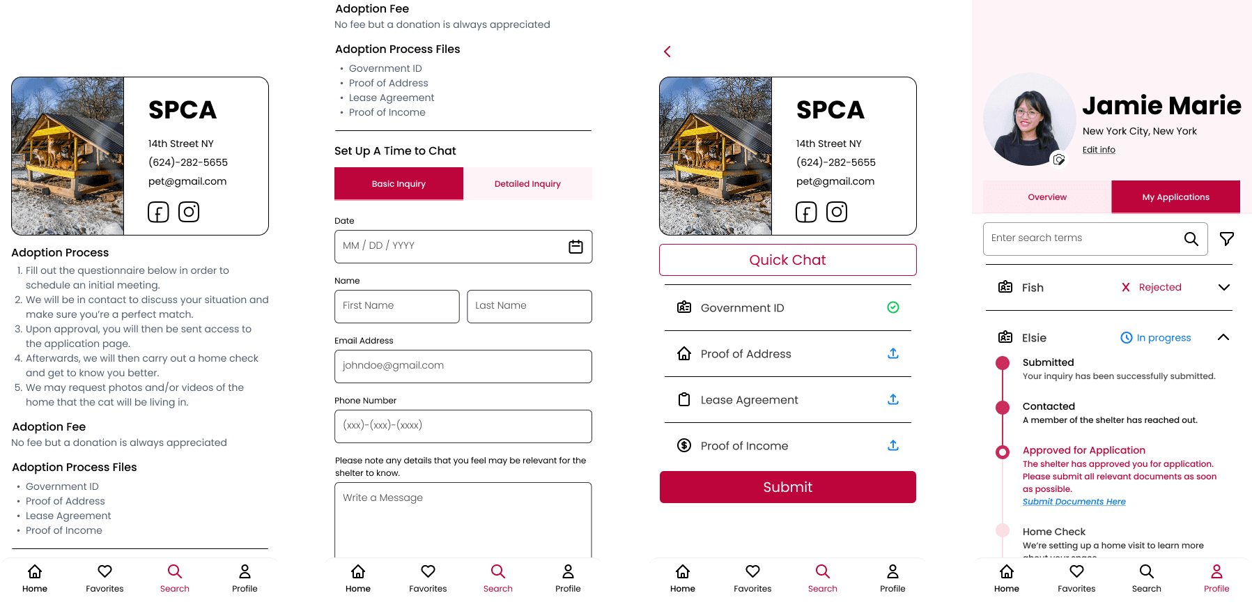
Contact, apply, and track all of your applications in one place without the stress.
My Contributions
Conducted Competitor and Market Research
Led Design for Onboarding and Key Compatibility Screens
Directed the Visual Design and Final High-Fidelity Screens
The Result
Our final presentation to UX professionals gave us the opportunity to receive thoughtful critique, industry insight, and encouragement on our work.
Industry professionals responded positively to the compatibility feature, sharing that it was something they would have genuinely been interested in and found valuable when searching for a pet themselves. They considered it a smart approach to unify the often fragmented process of discovering a met and navigating adoption into one cohesive experience through the app and expressed interest in seeing future features centered around proximity and location-based matching.
User Research
Pet Adopters wanted an easier way to know if the pet would match their lifestyle without relying solely on trial-and-error experiences.
We conducted structured user interviews with 6 current and prospective pet owners to better understand their adoption experiences, decision-making process, and the challenges they faced when determining compatibility with a pet.
Through our interviews, several recurring themes emerged around uncertainty, compatibility, and the emotional weight of adoption decisions:
“I think a lot of people underestimate how much work and effort it is.”
“...if I can't care for the cat, then the cat shouldn't live with me ”
“How expensive the maintenance and care would be… would probably be a deal breaker.”
User Personas
We Translated Interview Insights into Three User Personas, with a Focus on One Primary Persona
To make sure we fully discussed and covered all bases, we created user personas to ground ourselves in the needs and behaviors of different types of pet adopters. While we developed three distinct personas, we chose to focus on one specific persona to guide our core design decisions and ensure the experience addressed the most critical user needs in depth.

Purrfect Match
A compatibility-focused pet adoption experience designed to create more authentic matches.
scope
Designing a warm and transparent adoption experience that helps users find compatible pets.
role
User Research
Visual Design
Prototyping
Information Architecture
tools
Figma
important links
team
3 Product Designers
duration
13 Weeks
The Challenge
How might we help potential adopters get matched with pets that are highly-compatible to their needs and lifestyle?
Nearly 6 million animals enter U.S. shelters each year, yet 1 in 5 adopted pets are returned because the match wasn’t the right fit. Potential pet owners need a smarter way to find a pet that truly matches their preferences and lifestyle.
Our Solution
Purrfect Match, a compatibility focused product to connect users with pets that are fit their needs, habits, and lifestyle.
Start with an onboarding quiz in order to determine your initial preferences for pets.
Browse through multiple ways to discover an ideal pet, including a swipe and search system. Compare your compatibility with every pet you discover and more.
Contact, apply, and track all of your applications in one place without the stress.
My Contributions
Conducted Competitor and Market Research
Led Design for Onboarding and Key Compatibility Screens
Directed the Visual Design and Final High-Fidelity Screens
The Result
Our final presentation to UX professionals gave us the opportunity to receive thoughtful critique, industry insight, and encouragement on our work.
Industry professionals responded positively to the compatibility feature, sharing that it was something they would have genuinely been interested in and found valuable when searching for a pet themselves. They considered it a smart approach to unify the often fragmented process of discovering a met and navigating adoption into one cohesive experience through the app and expressed interest in seeing future features centered around proximity and location-based matching.
User Research
Pet Adopters wanted an easier way to know if the pet would match their lifestyle without relying solely on trial-and-error experiences.
We conducted structured user interviews with 6 current and prospective pet owners to better understand their adoption experiences, decision-making process, and the challenges they faced when determining compatibility with a pet.
Through our interviews, several recurring themes emerged around uncertainty, compatibility, and the emotional weight of adoption decisions:
“I think a lot of people underestimate how much work and effort it is.”
“...if I can't care for the cat, then the cat shouldn't live with me ”
“How expensive the maintenance and care would be… would probably be a deal breaker.”
User Personas
We Translated Interview Insights into Three User Personas, with a Focus on One Primary Persona
To make sure we fully discussed and covered all bases, we created user personas to ground ourselves in the needs and behaviors of different types of pet adopters. While we developed three distinct personas, we chose to focus on one specific persona to guide our core design decisions and ensure the experience addressed the most critical user needs in depth.
Competitive Research
Conducting Competitive Research Through the Lens of Our Persona to Identify Gaps in Existing Adoption Experiences
We analyzed 10 different adoption and shelter websites to understand common patterns, strengths, and pain points in existing adoption experiences.
Through this, I identified key opportunities for improvement and features that I wanted to bring into our own project:
Provide Thorough Pet Information without Over Complication
While shelters provided information on pets, I found that not all shelters provided the same information, especially when it came to medical needs. This made it difficult to gauge exactly how much it would cost financially to raise different pets.
Allow for Various Ways of Search and Filter
I really liked that some shelter websites had multiple ways of searching for pets but I also found that the filters provided could be really limiting for some users who may have specific common needs or wants.
Include Relevant Shelter Information and Ways to Contact
The websites I observed that I liked the most included shelter information on each pet page, including adoption fee costs, adoption process, and how to get in contact with the shelter. This was definitely a feature I knew we should implement into our own process.
Concepts to Visuals
Organizing All Our Concepts and Translating Them into Clear Visual Guides
We sketched out different variations of core screens and continued ideating on additional key features that could further improve the adoption experience, refine user flow, and better support pet compatibility decision-making.
From there, we translated our sketches into low-fidelity wireframes to help establish initial user flows and allow us to quickly discuss layout decisions and interactions before refinement.

Our Sketches

Low Fidelity Screens that I Created
User Testing
User Testing with Our Mid-Fidelity Revealed Navigation Confusion and Accessibility Concerns
I was in charge of making the changes and cleaning up the visual design and branding for our high-fidelity designs.

The original lavender navigation theme resulted in a low contrast ratio between the background and the white icons and buttons, creating accessibility concerns and reducing overall visual clarity.
Additionally, the glass transparency effect further decreased readability by reducing contrast and making interface elements
harder to distinguish.
I created an opaque navigation bar and indicated active icons using a darker shade of red that I confirmed to be accessible. I also included more details on each shelter page to include the process of adopting through each shelter to be more thorough about the information we provide to each user looking to adopt.
The original lavender navigation theme resulted in a low contrast ratio between the background and the white icons and buttons, creating accessibility concerns and reducing overall visual clarity.
Additionally, the glass transparency effect further decreased readability by reducing contrast and making interface elements harder to distinguish.
I created an opaque navigation bar and indicated active icons using a darker shade of red that I confirmed to be accessible. I also included more details on each shelter page to include the process of adopting through each shelter to be more thorough about the information we provide to each user looking to adopt.

Our application page originally was hidden under layers and split into two separate categories of Inquired and Applied. This confused users about the distinction between the two stages during the application process.
To combat this, I added a method of viewing all applications within the user's profile page. I removed the two different tabs and kept all the applications within one view, with further breakdown available upon clicking on each.
Final Designs
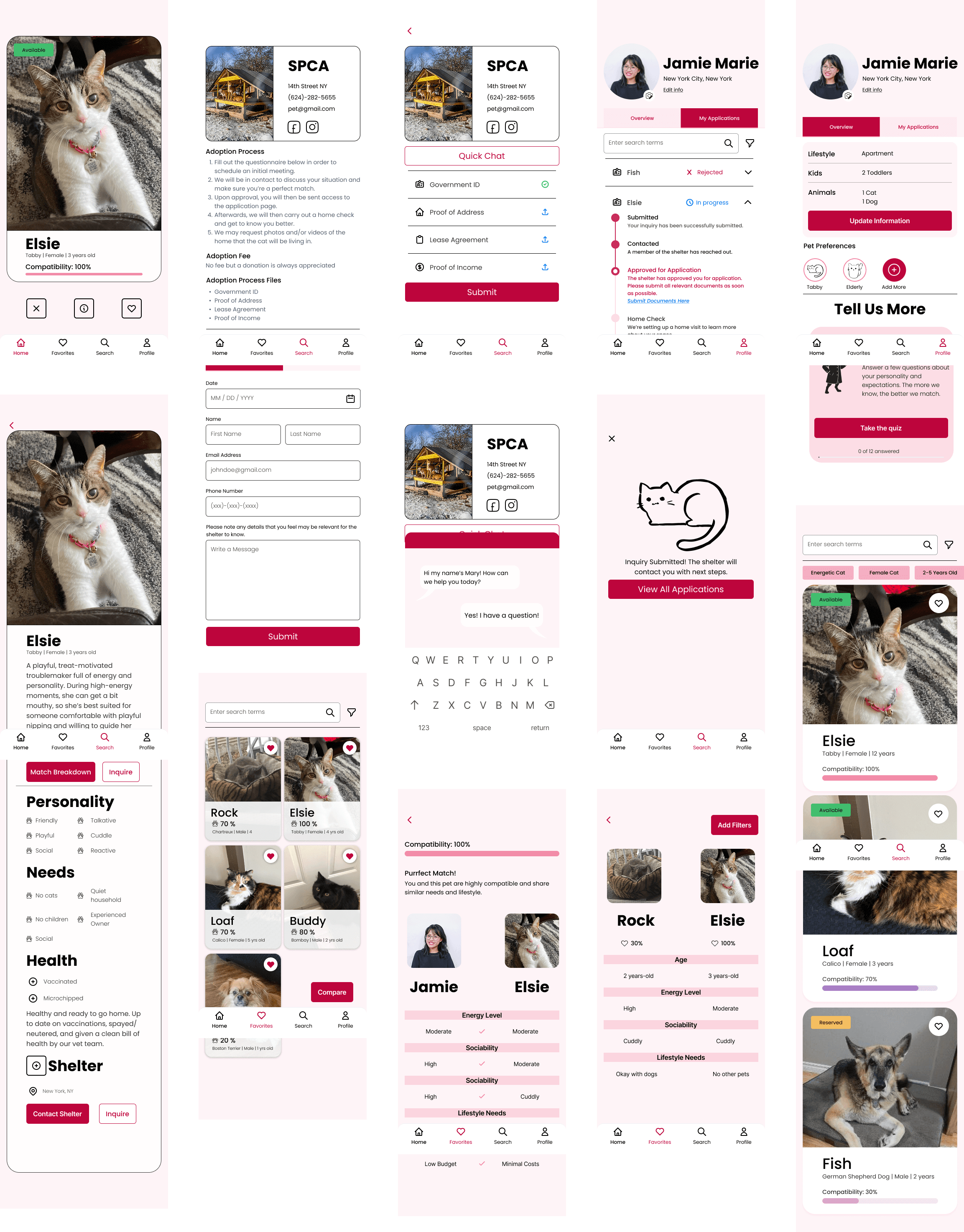
Creating a Warm, Simple, and Authentic Experience to Help Match Potential Pet Owners with their Purrfect Match.
User Flows
Defining what the overall flow for our product would look like.
Below is the overall user flow for our product. Click to take a closer look through all the steps!

Reflections
Keep it Simple
Our initial design focused a little too much on maintaining a playful aesthetic, which led to accessibility issues and unclear navigation flows. Through user testing and iteration, we learned the importance of balancing personality with usability, ensuring that visual design enhances and supports the experience rather than interfering with clarity, accessibility, and ease of navigation.
For next time,
Purrfect match is an app that focuses on helping owners and pets match. However, this also requires input from shelters to add pets and look over owner profiles. This is definitely something I would want to look more into in future steps and flesh out.
Additionally, while we had discussed geographical features such as finding shelters close to you, we did not have the time to implement them into our design. The professionals we presented to also considered it a smart idea to think about how geographical features could play into our product.
Competitive Research
Conducting Competitive Research Through the Lens of Our Persona to Identify Gaps in Existing Adoption Experiences
We analyzed 10 different adoption and shelter websites to understand common patterns, strengths, and pain points in existing adoption experiences.
Through this, I identified key opportunities for improvement and features that I wanted to bring into our own project:
Provide Thorough Pet Information without Over Complication
PWhile shelters provided information on pets, I found that not all shelters provided the same information, especially when it came to medical needs. This made it difficult to gauge exactly how much it would cost financially to raise different pets.
Allow for Various Ways of Search and Filter
I really liked that some shelter websites had multiple ways of searching for pets but I also found that the filters provided could be really limiting for some users who may have specific common needs or wants.
Include Relevant Shelter Information and Ways to Contact
The websites I observed that I liked the most included shelter information on each pet page, including adoption fee costs, adoption process, and how to get in contact with the shelter. This was definitely a feature I knew we should implement into our own process.
Concepts to Visuals
Organizing All Our Concepts and Translating Them into Clear Visual Guides
We sketched out different variations of core screens and continued ideating on additional key features that could further improve the adoption experience, refine user flow, and better support pet compatibility decision-making.
From there, we translated our sketches into low-fidelity wireframes to help establish initial user flows and allow us to quickly discuss layout decisions and interactions before refinement.
Our Sketches
Low Fidelity Screens that I Created
User Testing
User Testing with Our Mid-Fidelity Revealed Navigation Confusion and Accessibility Concerns
I was in charge of making the changes and cleaning up the visual design and branding for our high-fidelity designs.
The original lavender navigation theme resulted in a low contrast ratio between the background and the white icons and buttons, creating accessibility concerns and reducing overall visual clarity.
Additionally, the glass transparency effect further decreased readability by reducing contrast and making interface elements harder to distinguish.
I created an opaque navigation bar and indicated active icons using a darker shade of red that I confirmed to be accessible. I also included more details on each shelter page to include the process of adopting through each shelter to be more thorough about the information we provide to each user looking to adopt.
Our application page originally was hidden under layers and split into two separate categories of Inquired and Applied. This confused users about the distinction between the two stages during the application process.
To combat this, I added a method of viewing all applications within the user's profile page. I removed the two different tabs and kept all the applications within one view, with further breakdown available upon clicking on each.
Final Designs
Creating a Warm, Simple, and Authentic Experience to Help Match Potential Pet Owners with their Purrfect Match.
Our final wireframes with refined structure, navigation, and user flows, creating a cohesive experience with personalized onboarding, content support, and human support as core pathways.
Reflections
Keep it Simple
For next time,
Our initial design focused a little too much on maintaining a playful aesthetic, which led to accessibility issues and unclear navigation flows. Through user testing and iteration, we learned the importance of balancing personality with usability, ensuring that visual design enhances and supports the experience rather than interfering with clarity, accessibility, and ease of navigation.
Purrfect match is an app that focuses on helping owners and pets match. However, this also requires input from shelters to add pets and look over owner profiles. This is definitely something I would want to look more into in future steps and flesh out.
Additionally, while we had discussed geographical features such as finding shelters close to you, we did not have the time to implement them into our design. The professionals we presented to also considered it a smart idea to think about how geographical features could play into our product.