
Umami Design System
Creating a shared visual language for a fast growing platform that supports both designers and developers
scope
Creating a design system for Weee!
role
User Research
Visual Designer
tools
Figma
important links
team
4 Product Designers
duration
13 Weeks
The Challenge
Our Solution
Weee! has a ton of products and personality but no consistency to tie it together
As America's largest online Asian supermarket, Weee! has only been growing and expanding since its founding in 2015. However, the speed that built Weee! is now outpacing its design infrastructure, leading to inconsistent user experiences and a fragmented interface across the platform.
Introducing Umami! Designed to unify Weee!'s experience through a shared visual language.
Umami is known as the “fifth taste,” a savory flavor that brings balance, depth, and harmony to a dish. While subtle on its own, it enhances and connects every ingredient around it.
Just as Umami makes everything taste more complete, a design system makes every product experience more coherent. Umami is Weee!’s shared design language, connecting teams through a unified system that makes every interaction feel more complete.
The Challenge
Our Solution
Weee! has a ton of products and personality but no consistency to tie it together
As America's largest online Asian supermarket, Weee! has only been growing and expanding since its founding in 2015. However, the speed that built Weee! is now outpacing its design infrastructure, leading to inconsistent user experiences and a fragmented interface across the platform.
Introducing Umami! Designed to unify Weee!'s experience through a shared visual language.
Umami is known as the “fifth taste,” a savory flavor that brings balance, depth, and harmony to a dish. While subtle on its own, it enhances and connects every ingredient around it.
Just as Umami makes everything taste more complete, a design system makes every product experience more coherent. Umami is Weee!’s shared design language, connecting teams through a unified system that makes every interaction feel more complete.

Umami is designed by and follows three core principles:
Design for All Users
Accessibility is treated as a core requirement, ensuring Umami delivers inclusive, intuitive, and usable experiences for all users.
Be Authentic and True
Authenticity builds trust through transparent, honest design that clearly reflects content and functionality for users.
Build with Flexibility in Mind
Flexibility creates a foundation for systems that can evolve with changing needs rather than break under them.
Umami is designed by and follows three core principles:
Design for All Users
Accessibility is treated as a core requirement, ensuring Umami delivers inclusive, intuitive, and usable experiences for all users.
Be Authentic and True
Authenticity builds trust through transparent, honest design that clearly reflects content and functionality for users.
Build with Flexibility in Mind
Flexibility creates a foundation for systems that can evolve with changing needs rather than break under them.

The Result
I worked on deconstructing the existing product with a focus on colors, visualizing and designing new elements including input fields and banners, and creating and populating the documentation site.
We presented our work to a room of stakeholders*
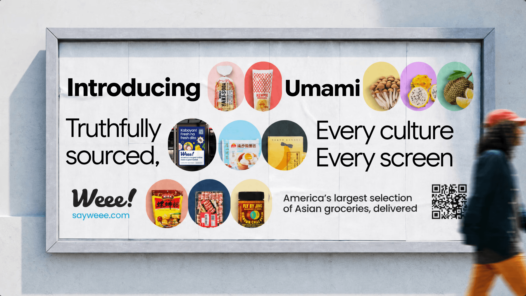
With our pitch deck, we presented Umami to company stakeholders, explaining why Umami was needed and exactly how it benefitted not only designers, but also developers and users of Weee!. We highlighted how a unified design system would improve consistency, improve collaboration across teams, and create a more scalable foundation for future growth and product development.
Visit our Pitch Deck Here!
*For full transparency, it is important to note that stakeholders were simulated by select members of our class acting in the role to provide feedback and critique.
Deconstructing Weee
Breaking down the Product into its Core Ingredients to what makes up Weee!
To better understand the experience that currently composed Weee!, we began by analyzing the current elements and patterns that shaped the platform. Each team member took on two different key users flows, capturing screenshots of every component, layout, and interaction to compile into a master inventory.
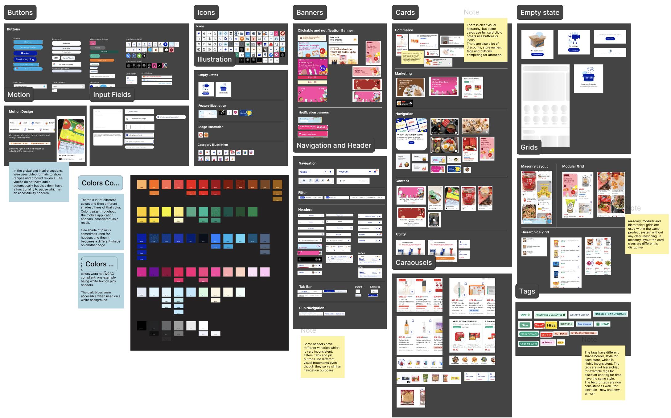
From this, we were able to synthesize two key insights:
Color Inconsistencies created Visual Noise and Contrast Failure
Competing Components Reduced Scalability and Clarity
Establishing Design Tokens
Building a Strong Foundation through Structured Naming and Tokens
Our first step in creating a design system was to establish a strong foundation by defining a consistent naming system, ensuring clarity, scalability, and alignment across all components and patterns.
To ensure scalability, we used design tokens to centralize design values so that updates could automatically propagate across the system and maintain consistency at scale.

Umami Design System
Creating a shared visual language for a fast growing platform that supports both designers and dvelopers
scope
Creating a design system for Weee!
role
Visual Designer
User Research
Visual Designer
tools
Figma
important links
team
4 Product Designers
duration
13 Weeks
The Challenge
Weee! has a ton of products and personality but no consistency to tie it together.
As America's largest online Asian supermarket, Weee! has only been growing and expanding since its founding in 2015. However, the speed that built Weee! is now outpacing its design infrastructure, leading to inconsistent user experiences and a fragmented interface across the platform.
Our Solution
Introducing Umami! Designed to unify Weee!'s experience through a shared visual language.
Umami is known as the “fifth taste,” a savory flavor that brings balance, depth, and harmony to a dish. While subtle on its own, it enhances and connects every ingredient around it.
Just as Umami makes everything taste more complete, a design system makes every product experience more coherent. Umami is Weee!’s shared design language, connecting teams through a unified system that makes every interaction feel more complete.
Umami is designed by and follows three core principles:
Design for All Users
Accessibility is treated as a core requirement, ensuring Umami delivers inclusive, intuitive, and usable experiences for all users.
Be Authentic and True
Authenticity builds trust through transparent, honest design that clearly reflects content and functionality for users.
Build with Flexibility in Mind
Flexibility creates a foundation for systems that can evolve with changing needs rather than break under them.
Alongside those principles, Umami offers 3 key components:
My Contributions
Deconstructing the existing Weee! mobile application
Creating new consistent elements including colors, input fields, and banners
Making a documentation site with accessibility and component guidelines
The Result
Stakeholders* Were Excited by the System’s Future Potential
With our pitch deck, we presented Umami to company stakeholders, explaining why Umami was needed and exactly how it benefitted not only designers, but also developers and users of Weee!. We highlighted how a unified design system would improve consistency, improve collaboration across teams, and create a more scalable foundation for future growth and product development.
Visit our Pitch Deck Here!
*For full transparency, it is important to note that stakeholders were simulated by select members of our class acting in the role to provide feedback and critique.
Deconstructing Weee
Breaking down the Product into its Core Ingredients to what makes up Weee!
To better understand the experience that currently composed Weee!, we began by analyzing the current elements and patterns that shaped the platform. Each team member took on two different key users flows, capturing screenshots of every component, layout, and interaction to compile into a master inventory.
From this, we were able to synthesize two key insights:
Color Inconsistencies created Visual Noise and Contrast Failure
Competing Components Reduced Scalability and Clarity
Color Inconsistencies created Visual Noise and Contrast Failure
Competing Components Reduced Scalability and Clarity
Establishing Design Tokens
Building a Strong Foundation through Structured Naming and Tokens
Our first step in creating a design system was to establish a strong foundation by defining a consistent naming system, ensuring clarity, scalability, and alignment across all components and patterns.
To ensure scalability, we used design tokens to centralize design values so that updates could automatically propagate across the system and maintain consistency at scale.
Refining Core Ingredients
Curating and Simplifying Existing Elements to Define What Truly Belongs in the System
Next, we began working on refining the existing elements.
My major contribution to this phase of the project was the color system, where I define and refine the palette while also conducting accessibility checks to ensure all colors met contrast standards and remained inclusive across the system.
Because Weee! already had established brand guidelines, I referenced their existing palette and streamlined it from 20+ colors down to 7 core colors. To maintain flexibility despite the reduced palette, I introduced transparency variations for each hue, allowing the system to support a wider range of use cases while preserving visual consistency and scalability.

I followed WCAG color contrast checkers in order to ensure that each main hue was accessible with either black or white.
I followed WCAG color contrast checkers in order to ensure that each main hue was accessible with either black or white.

Crafting the Components
Turning Foundational Ingredients into Reuseable and Scalable UI patterns
With our key elements in place, we started to build upon them to create reusable components. I was primarily responsible for input fields and banners.
Applying Recognition Over Recall in Design
While designing input fields, I referenced Jakob Nielsen’s heuristic of recognition over recall by keeping help messages persistent outside of the input field when additional guidance was needed.
I also avoided relying solely on color to communicate errors, pairing visual indicators with descriptive text to create a more accessible experience.

Designing Flexible Banner Variations
While designing banners, I had to account for both horizontal and vertical variations across different layouts and screen sizes.
A key challenge was ensuring each variation remained visually recognizable and consistent within the system while still fitting naturally within varying page structures and content constraints.

Identifying Gaps Through Testing
Testing Revealed Missing Core Components in our System
We tested our design system with other product designers by asking them to recreate two key page, the home page and the product page. From these tests, we were able to identify key areas of iterations:
Add and Expand to Our Current Component Set
Realign all Components within our Layout Grid
Ensure Consistent Naming Across All Components and Elements
With these changes made, we were able to reduce the time it would take to reproduce the Weee! homepage from 3 minutes to 1 minute.
Documenting the System
Creating a Recipe Book to Establish a Single Source of Truth for the System
To bring the project together, we created a centralized documentation site that acted as a single source of truth for the system. The site consolidated component guidelines, design standards, accessibility considerations, and reusable assets into one organized resource, making it easier for teams to maintain consistency and scale the system over time.
We also included a Getting Started page for new users or team members unfamiliar with design systems, along with a Resources page that provided additional guidance on design systems and how to contribute to the system collaboratively.
In doing so, we aimed to make Umami easier to adopt, more approachable for new contributors, and better equipped for long-term growth and sustainability.
We presented our work to a room of UX peers who evaluated our process and design rationale. Their feedback highlighted the strengths of our solution while also revealing new areas for us to keep iterating on.


Visit our full Documentation Site Here!
Reflections
Less is More
When we first started this project, we underestimated the scope of how extensive an ecommerce platform would be to analyze, break down, and rebuild into a cohesive design system. Early on, we attempted to account for every possible component, pattern, and edge case, which quickly became overwhelming and difficult to maintain.
Rather than creating an excessive number of variations or solutions, we had to prioritize the most essential and reusable elements that could scale across the system. Simplifying the system not only improved consistency and usability, but also made the design language easier for others to understand, adopt, and contribute to over time.
For next time,
While we designed Umami to be flexible and scalable with Weee!'s growth, it is important to note that Weee also has a very extensive website platform. As such, further down this project, I would love to also analyze Weee!'s web application and learn more about making responsive designs between web and mobile.
Reflections
Less is More
When we first started this project, we underestimated the scope of how extensive an ecommerce platform would be to analyze, break down, and rebuild into a cohesive design system. Early on, we attempted to account for every possible component, pattern, and edge case, which quickly became overwhelming and difficult to maintain.
Rather than creating an excessive number of variations or solutions, we had to prioritize the most essential and reusable elements that could scale across the system. Simplifying the system not only improved consistency and usability, but also made the design language easier for others to understand, adopt, and contribute to over time.
For next time,
While we designed Umami to be flexible and scalable with Weee!'s growth, it is important to note that Weee also has a very extensive website platform. As such, further down this project, I would love to also analyze Weee!'s web application and learn more about making responsive designs between web and mobile.
Defining Design Requirements
Curating and Simplifying Existing Elements to Define What Truly Belongs in the System
Next, we began working on refining the existing elements.
My major contribution to this phase of the project was the color system, where I define and refine the palette while also conducting accessibility checks to ensure all colors met contrast standards and remained inclusive across the system.
Because Weee! already had established brand guidelines, I referenced their existing palette and streamlined it from 20+ colors down to 7 core colors. To maintain flexibility despite the reduced palette, I introduced transparency variations for each hue, allowing the system to support a wider range of use cases while preserving visual consistency and scalability.
I followed WCAG color contrast checkers in order to ensure that each main hue was accessible with either black or white.
Crafting the Components
Turning Foundational Ingredients into Reuseable and Scalable UI patterns
With our key elements in place, we started to build upon them to create reusable components. I was primarily responsible for input fields and banners.
While designing input fields, I referenced Jakob Nielsen’s heuristic of recognition over recall by keeping help messages persistent outside of the input field when additional guidance was needed.
I also avoided relying solely on color to communicate errors, pairing visual indicators with descriptive text to create a more accessible experience.
Applying Recognition Over Recall in Design
Designing Flexible Banner Variations
While designing banners, I had to account for both horizontal and vertical variations across different layouts and screen sizes.
A key challenge was ensuring each variation remained visually recognizable and consistent within the system while still fitting naturally within varying page structures and content constraints.
Testing Revealed Missing Core Components in our System
Testing Revealed Missing Core Components in our System
We tested our design system with other product designers by asking them to recreate two key page, the home page and the product page. From these tests, we were able to identify key areas of iterations:
Add and Expand to Our Current Component Set
Realign all Components within our Layout Grid
Ensure Consistent Naming Across All Components and Elements
With these changes made, we were able to reduce the time it would take to reproduce the Weee! homepage from 3 minutes to 1 minute.
Documenting the System
Creating a Recipe Book to Establish a Single Source of Truth for the System
To bring the project together, we created a centralized documentation site that acted as a single source of truth for the system. The site consolidated component guidelines, design standards, accessibility considerations, and reusable assets into one organized resource, making it easier for teams to maintain consistency and scale the system over time.
We also included a Getting Started page for new users or team members unfamiliar with design systems, along with a Resources page that provided additional guidance on design systems and how to contribute to the system collaboratively.
In doing so, we aimed to make Umami easier to adopt, more approachable for new contributors, and better equipped for long-term growth and sustainability.
We presented our work to a room of UX peers who evaluated our process and design rationale. Their feedback highlighted the strengths of our solution while also revealing new areas for us to keep iterating on.
Visit our full Documentation Site Here!
Reflections
Less is More
When we first started this project, we underestimated the scope of how extensive an ecommerce platform would be to analyze, break down, and rebuild into a cohesive design system. Early on, we attempted to account for every possible component, pattern, and edge case, which quickly became overwhelming and difficult to maintain.
Rather than creating an excessive number of variations or solutions, we had to prioritize the most essential and reusable elements that could scale across the system. Simplifying the system not only improved consistency and usability, but also made the design language easier for others to understand, adopt, and contribute to over time.
For next time,
While we designed Umami to be flexible and scalable with Weee!'s growth, it is important to note that Weee also has a very extensive website platform. As such, further down this project, I would love to also analyze Weee!'s web application and learn more about making responsive designs between web and mobile.