
Discover
Users were Hindered by Lack of Literacy, Gaps, and Fear
Define
Personalized Onboarding, Content, and Human Support
Develop
Designing to Empower First Generation Immigrants
Deliver
Personalized Onboarding
Content Support
Human Support
Reflections
Takeaways
How might we help first-generation immigrants confidently learn and navigate the U.S. financial system?
Our Result
We wanted to create a low stress environment where first-generation immigrants could learn at their own pace, with the support they looked for, all in one place. Our solution is a gamified, learning application designed to empower learning by making the complicated simple.
By providing clear content organization and guided learning flows, the platform is projected to streamline financial learning, reduce user confusion, and support more confident task completion.
Discover
Users were hindered by Lack of Literacy, Resource Gaps, and Fear
Each team member conducted user interviews, and I led two focused on banking habits and financial challenges. Transcripts were synthesized into affinity maps and mental models.


Figure 2. Our mental model, created from user quotes and affinity diagrams
Key Takeaways
Define
Addressing Pain Points through Personalized Onboarding, Content, and Human Support
With core insights established, I conducted competitor research to validate that this concept addressed a real gap not met by existing financial tools.
Coursera
Pros
A variety of courses in any category
Ability to download courses to study offline
Multilingual support with auto-translation built into the platform
Cons
Lack of multi-language support
Focused primarily on learning financial literacy, not navigating through the system
Unable to foster a community or get any peer support
Zogo: Learn and Earn
Pros
Finance-specific gamified application
Bite-sized lessons for easy learning
Based on real-world scenarios
Cons
Designed for global learning
Onboarding assumes digital literacy and familiarity with learning platforms
Classes are more academic or theoretically based
No practical tools
Ideating Core Concepts
With all the insights in place, we began creating potential design concepts for our project prompt. From this process, I organized our concepts into three main categories, each representing a distinct approach to addressing our users’ needs:
To guide our design process, I also established clear requirements that would shape and inform each concept. These requirements acted as parameters and constraints, ensuring each concept aligned with project objectives and user research insights.
Develop
Designing Accessible Learning to Empower First-Generation Immigrants
Finding the Navigation
We went through several renditions of our information architecture in order to create one that would focus on our key concepts instead of focusing on creating the entire application.
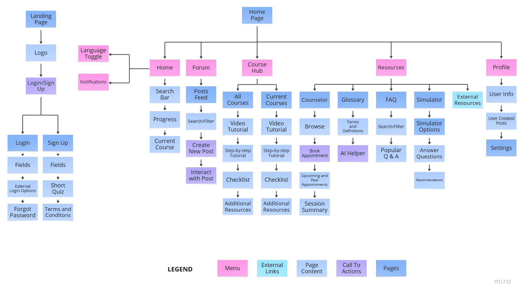
Before
Too many unnecessary screens that did not focus around solving our problem statement.

After
An information architecture that focused on core screens to our problem.
Figure 3. Our final information architecture
Visualizing Concepts
I sketched out all my ideas and variations I was thinking about, refining them after a group meeting.


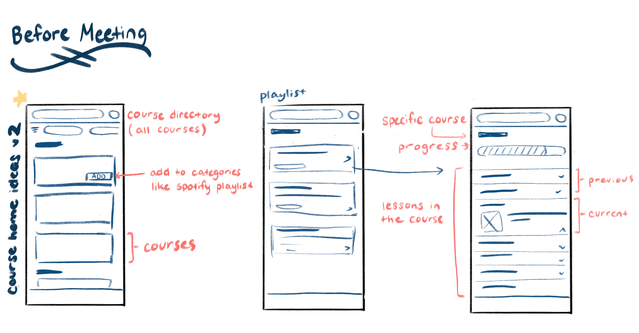
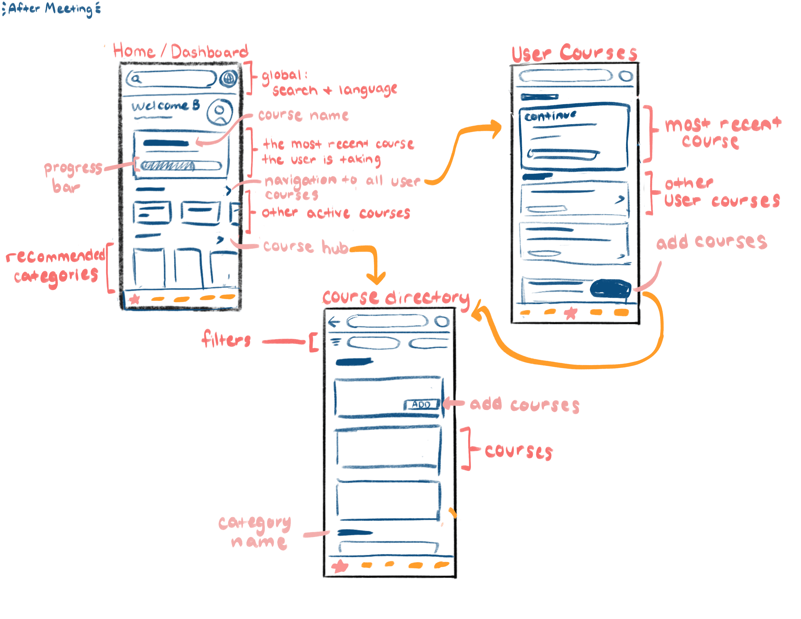
Figure 4. My initial Wireframes ( Left ) and Refined Wireframes after meeting with teammates ( Right )
Designing For Accessibility
Once our concepts started taking shape, one of my teammates established a design system to ensure consistency across components, interactions, and visual elements. During this stage, we also conducted accessibility testing, which revealed that our initial color palette did not meet AA standards. We updated the palette accordingly, ensuring that our designs were inclusive and accessible to all users.
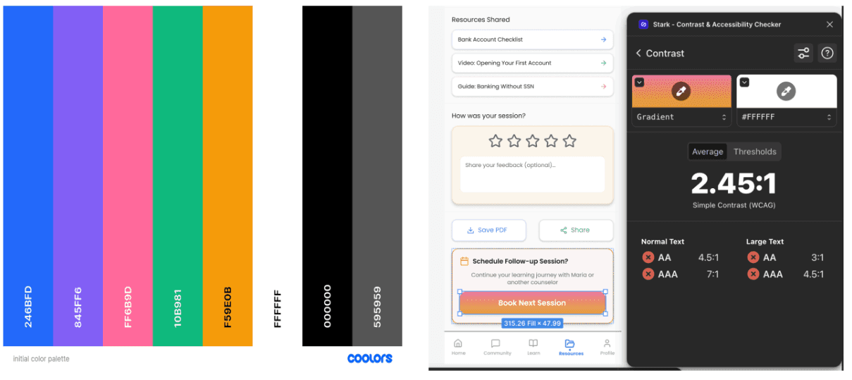
Figure 5. Initial color palette that did not meet WCAG standards


Figure 6. WCAG Accessible Color Palette
Deliver
Finalizing the Experience and Sharing Our Vision
High-Fidelity Wireframes
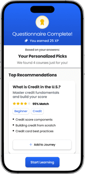
A personalized onboarding experience to find courses immediately related to the user's needs and goals


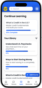
Easily accessible variety of content support including AI-assisted glossaries, multilingual toggles, and end of lesson quizzes


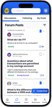
Providing community insight and culturally relevant counseling to guide users through financial challenges


We presented our work to a room of UX peers who evaluated our process and design rationale. Their feedback highlighted the strengths of our solution while also revealing new areas for us to keep iterating on.

Figure 7. Live class feedback during our final presentation
Reflections
What's Next?
Future Steps
If developed further, the next steps would focus on expanding cultural inclusivity and ensuring the experience supports a broader range of users. This includes adding more language and cultural options, as well as transforming key components into fully functional, interactive features. Additionally, conducting more extensive testing across diverse age groups, financial backgrounds, and levels of digital literacy would help ensure the design remains intuitive, equitable, and accessible for all users
Lessons Learned
Early Research is Key
Foundational research shaped our direction early, revealing real user challenges and preventing us from designing from assumptions.
Small Decisions Have Big Impact
Even minor content and layout choices meaningfully affected user flow and confidence throughout the experience.
Engaging Isn’t Always Effective
Usability testing revealed that elements we thought were “fun” or “interactive” sometimes distracted users rather than supporting them.
Design Documentation
First Spark
An in-depth explanation of the process taken to design the interface First Spark
Read Now